Top Information Architecture Principles for UX Success

Building Websites Users Will Love: A Deep Dive into IA
Want to create websites that users find intuitive and enjoyable? This listicle explores key information architecture (IA) principles crucial for building successful online experiences. Learn how to organize and structure your website content effectively using concepts like the Principle of Least Effort, Progressive Disclosure, and Information Scent. Mastering these principles will empower you to design user-friendly websites that are both high-performing and easy to navigate, ultimately boosting user engagement and satisfaction. Good IA directly translates into happier clients and better business outcomes.
1. Principle of Least Effort
The Principle of Least Effort, a cornerstone of effective information architecture, asserts that users will invariably opt for the easiest path to achieve their objectives. This translates to designing systems that minimize both cognitive load (the mental effort required to understand and use the system) and physical effort, such as excessive clicking or scrolling. The goal is to make information readily accessible and easily digestible with the fewest possible steps. By adhering to this principle, you create a seamless and intuitive user experience that encourages engagement and reduces frustration.
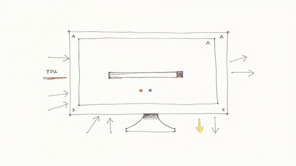
This principle deserves its place on this list because it directly addresses a fundamental aspect of human behavior. People are inherently inclined to conserve energy, both mental and physical. By designing with this in mind, you cater to this natural inclination, making your website or application more user-friendly and ultimately more successful. The principle emphasizes simplicity and efficiency, adopting a user-centered design approach to streamline navigation paths and reduce the mental burden on users. This results in features like clear labeling, intuitive navigation menus, and strategically placed calls to action.
Successful Implementations:
- Google's Search Interface: The minimalist design, with its prominent search bar and limited distractions, exemplifies the Principle of Least Effort. Users can quickly input their query and receive relevant results with minimal cognitive overhead.
- Amazon's 1-Click Ordering: This feature drastically reduces the friction involved in making a purchase, allowing users to buy items with a single click, eliminating multiple steps and form-filling.
- Apple's design philosophy: Apple prioritizes usability, often simplifying feature sets to create a more intuitive and less overwhelming user experience.
Actionable Tips:
- User Journey Mapping: Visualize the steps users take to accomplish tasks on your website or app. This helps identify friction points and areas where the Principle of Least Effort can be applied.
- Analytics Analysis: Use website analytics to pinpoint areas where users struggle, such as high bounce rates on certain pages or drop-offs during checkout. This data can inform design changes to reduce effort.
- Progressive Disclosure: Instead of overwhelming users with information upfront, gradually reveal complexity as needed. This simplifies the initial interaction and allows users to delve deeper only when necessary.
- User Testing: Regularly test your designs with actual users to validate your assumptions about what constitutes "least effort" for your specific target audience.
Pros:
- Improved User Satisfaction and Retention: Easier-to-use systems lead to happier users who are more likely to return.
- Reduced Abandonment Rates: Minimizing friction reduces the likelihood of users abandoning tasks or the site altogether.
- Increased Task Completion Rates: Streamlined processes make it more likely that users will successfully complete their desired actions.
- More Intuitive Interfaces: Applying this principle results in interfaces that feel natural and easy to navigate.
Cons:
- Oversimplification: In some cases, overly simplifying complex information can be detrimental, leading to a lack of necessary detail or functionality.
- Varying User Needs: Defining "ease" can be subjective and vary across different user groups. Extensive user research is crucial to address diverse needs.
- Implementation Challenges: Implementing this principle effectively can require significant effort in design and development, particularly for complex systems.
When and Why to Use This Approach:
The Principle of Least Effort should be a guiding principle throughout the entire design and development process. It is particularly crucial when:
- Designing core user flows: Make it as easy as possible for users to accomplish their primary goals.
- Developing complex systems: Break down complex tasks into smaller, manageable steps.
- Creating information-rich websites: Organize and present information in a clear and concise manner to prevent cognitive overload.
By embracing the Principle of Least Effort, you create digital experiences that are not only functional but also enjoyable and efficient, leading to increased user engagement and satisfaction. This principle, popularized by figures like George Zipf, Steve Krug (author of "Don't Make Me Think"), and Jakob Nielsen, remains a fundamental tenet of good UX design.
2. Progressive Disclosure
Progressive disclosure is a crucial information architecture (IA) technique that streamlines user experience by strategically sequencing information and actions. Instead of bombarding users with everything at once, it reveals information in layers, providing only what's necessary at each stage. This "just-in-time" approach simplifies complex interfaces and makes navigating content much easier. For web designers, marketers, and entrepreneurs building online experiences, understanding and implementing progressive disclosure is key to creating user-friendly websites and applications that cater to both novice and expert users.
This technique deserves a prominent place in any IA principles list because it directly addresses cognitive overload – a major usability hurdle. By presenting information incrementally, you prevent users from feeling overwhelmed, leading to a more focused and enjoyable experience. This principle is particularly relevant in today's digital landscape where users are constantly bombarded with information.
How Progressive Disclosure Works:
Progressive disclosure leverages a hierarchical organization of content. Initial screens display essential information and core functionalities. Further details or advanced options become available through user interaction, such as clicking a button, expanding a section, or progressing to the next step in a process. This layered presentation ensures users aren't confronted with unnecessary complexity until they actively seek it out.
Features of Progressive Disclosure:
- Layered presentation of information: Content is structured hierarchically, with primary information readily accessible and secondary information tucked away neatly.
- Just-in-time information delivery: Information is revealed only when the user needs or requests it, ensuring relevance and minimizing distraction.
- Contextual revelation of complexity: Advanced features or details are revealed within the context of the user's current task or interaction.
- Hierarchical organization of content: Content is strategically arranged from general to specific, guiding the user through a logical progression.
Examples of Successful Implementation:
- Advanced settings sections in applications: Instead of crowding the main settings page, applications often tuck advanced settings within separate menus, accessible to those who need them.
- Expandable/collapsible content sections (accordions): FAQs, product descriptions, and other lengthy content can be managed effectively using accordions, allowing users to expand sections as needed.
- Multi-step checkout processes in e-commerce: Breaking the checkout process into smaller, manageable steps simplifies the experience and reduces the chance of abandonment.
- Facebook's gradual introduction of platform features: Facebook is known for its gradual rollout of new features, often starting with a small test group before releasing to a wider audience. This allows them to gather feedback and refine features before full deployment.
Pros:
- Reduces cognitive overload: By prioritizing essential information, it simplifies the user experience.
- Creates cleaner, more focused interfaces: Decluttered interfaces improve usability and visual appeal.
- Allows for handling complex processes in manageable steps: Breaking down complex tasks enhances user understanding and reduces errors.
- Supports both novice and expert users: Beginners can focus on core functionalities, while experienced users can access advanced features as required.
Cons:
- Can increase the number of clicks needed to complete tasks: Accessing deeper levels of information requires additional interaction.
- May hide important functionality that users need to discover: If not implemented carefully, essential features may be overlooked.
- Requires careful planning to ensure logical progression: The hierarchy of information needs to be well-defined and intuitive.
Actionable Tips for Implementation:
- Always reveal essential information first: Prioritize content based on user needs and frequency of use.
- Use clear signposts for accessing additional information: Employ clear visual cues (e.g., "+", "More", arrows) to indicate the availability of more information.
- Consider different disclosure mechanisms (accordions, tooltips, modals): Choose the appropriate mechanism based on the context and the type of information being disclosed.
- Test with users to ensure they can find important but less frequently used features: Usability testing can identify potential navigation issues and ensure all essential features are discoverable.
Popularized By:
The concept of progressive disclosure has been championed by influential figures in the UX/UI field including Ben Shneiderman (interaction design pioneer), Jesse James Garrett (author of "The Elements of User Experience"), and the Nielsen Norman Group (renowned usability research organization). Their work has highlighted the importance of managing complexity and minimizing cognitive load for optimal user experience.
3. Organizing Principle
The Organizing Principle is a cornerstone of effective information architecture. It dictates how information is structured, categorized, and presented to users, directly impacting their ability to find what they need and understand the relationships between different pieces of content. This principle involves carefully selecting the best method for grouping and arranging information based on users' mental models – how they intuitively expect information to be organized – and their typical information-seeking behaviors. A well-defined organizing principle transforms a chaotic collection of data into a user-friendly, navigable system.
This principle deserves its place on this list because a solid organizational structure is fundamental to a positive user experience. Key features of a robust organizing principle include: classifying content into logical groups, establishing meaningful relationships between content items, creating intuitive hierarchies, and implementing consistent labeling systems. These features contribute to a website or app that is both easy to navigate and understand.
Benefits of a Well-Defined Organizing Principle:
- Improved Information Findability: Users can quickly locate the information they need.
- Support for User Mental Models: The structure aligns with users’ intuitive expectations.
- Predictable Navigation Patterns: Users can anticipate where to find information.
- Scalability: The system can accommodate growth and changes in content over time.
Potential Drawbacks:
- Varying User Preferences: Different user groups may have different organizational preferences.
- Multiple Valid Schemes: Accommodating multiple valid organizing schemes can be challenging.
- Research Intensive: Identifying the optimal organizational structure often requires user research.
Examples of Successful Implementation:
- Library Classification Systems: Dewey Decimal and Library of Congress systems categorize books for easy retrieval.
- E-commerce Category Structures: Amazon's hierarchical department structure facilitates browsing and product discovery.
- Wikipedia's Categorization System: A comprehensive system linking related articles allows users to explore a vast knowledge base.
- Government Websites: Often organized by audience, topic, and services for targeted access to information.
Actionable Tips for Implementation:
- Card Sorting: Conduct card sorting exercises with representative users to gain insights into their mental models.
- Multiple Schemes: Consider implementing multiple organizing schemes (e.g., by topic, task, audience) to cater to diverse user needs.
- Consistent Labeling: Use clear, consistent labeling that reflects user vocabulary, not internal jargon.
- Regular Audits: Regularly audit and refine the organizational structure as content evolves and user behavior changes.
When and Why to Use This Approach:
The Organizing Principle is essential for any project involving significant amounts of information, whether it’s a website, application, intranet, or even a document repository. It is particularly critical when:
- Dealing with complex information: A clear structure is essential for making complex information manageable.
- Targeting diverse user groups: Different organizational schemes may be necessary to cater to different audiences.
- Planning for scalability: The chosen structure should be able to accommodate future growth and changes.
The Organizing Principle, popularized by information architecture pioneers like Richard Saul Wurman, Peter Morville, Louis Rosenfeld, and Abby Covert, is crucial for creating user-centered information systems. By focusing on how users think and seek information, you can design systems that are intuitive, efficient, and ultimately successful.
4. Information Scent
Information scent refers to the cues that users pick up on to predict what they'll find if they follow a particular path through a website or app. It's the digital equivalent of following the aroma of freshly baked bread to find a bakery. Strong information scent allows users to efficiently navigate towards their goals, while weak scent leads to frustration, confusion, and ultimately, abandonment. This principle is crucial for creating intuitive and user-friendly digital experiences, making it a cornerstone of effective information architecture.
Imagine searching for a specific type of shoe on an e-commerce site. If the category labels, filters, and product thumbnails accurately reflect the available options and guide you toward your desired product, the site has strong information scent. Conversely, if the navigation is unclear, the product descriptions are vague, and the visuals are misleading, the scent is weak, making it difficult to find what you're looking for.
How it Works:
Information scent relies on the user's ability to form expectations based on the cues presented to them. These cues can be textual (like link labels, headings, and descriptions), visual (like icons, images, and layout), or even contextual (based on the user's previous actions or the current location within the site). The stronger and more accurate these cues are, the easier it is for users to predict whether a particular path will lead them to the information they seek.
Features of Strong Information Scent:
- Clear, descriptive labels and navigation elements: Avoid generic terms like "More" or "Click Here." Instead, use specific language that accurately reflects the destination content.
- Visual cues that indicate content types: Use icons and imagery to quickly communicate the nature of the content behind a link or within a section.
- Contextual hints about destination content: Provide short previews or summaries to give users a glimpse of what they can expect to find.
- Consistent patterns that build predictability: Maintain a consistent visual and structural language throughout the site to help users learn the system and anticipate where to find specific types of information.
Examples of Successful Implementation:
- Amazon's breadcrumb navigation: Clearly shows the product categorization hierarchy, allowing users to understand their current location and easily navigate to broader categories.
- Google search snippets: Provide previews of web page content, helping users determine the relevance of a search result before clicking.
- Netflix's thumbnail images and descriptions for recommendations: Offer visual and textual cues about the genre, actors, and plot of each movie or show, aiding users in making informed choices.
- News website headline structures that convey article content: Use concise and informative headlines to clearly communicate the topic and key takeaways of each article.
Pros:
- Reduces user frustration and abandonment: Clear scent allows users to find what they're looking for quickly and easily.
- Increases navigation efficiency: Users can make informed decisions about which paths to follow, reducing wasted time and clicks.
- Improves overall user confidence in the system: A predictable and easy-to-navigate site builds trust and encourages further exploration.
- Supports goal-directed browsing behavior: Strong scent helps users stay focused on their objectives and complete their tasks efficiently.
Cons:
- Creating strong scent requires deep understanding of user goals: Effective implementation necessitates thorough user research and analysis.
- May require ongoing refinement based on user feedback: Scent can be improved over time by monitoring user behavior and making adjustments as needed.
- Can be difficult to implement in systems with highly diverse content: Maintaining clear and consistent scent across a wide range of content can be challenging.
Tips for Implementing Information Scent:
- Use descriptive, jargon-free link text that clearly indicates destination.
- Implement meaningful page titles, headings, and metadata.
- Include contextual previews or summaries where appropriate.
- Test navigation paths with real users to validate scent strength. Tools like user testing and A/B testing can provide valuable insights.
Why Information Scent Matters:
For freelance web designers, digital marketing agencies, startup founders, solo entrepreneurs, and UX/UI specialists, understanding and implementing information scent is crucial for creating websites and applications that are both user-friendly and effective. By providing clear and consistent cues, you can guide users towards their goals, improve conversion rates, and build a loyal user base. Information scent, popularized by researchers like Peter Pirolli, Stuart Card, Jared Spool, and Jakob Nielsen, is not just a theoretical concept—it’s a practical principle that directly impacts the success of any digital product.
5. Mental Models Alignment
Mental Models Alignment is a crucial principle of information architecture that focuses on structuring information in a way that resonates with users' pre-existing understanding and expectations. It acknowledges that users approach digital systems with ingrained mental models of how information should be organized, based on their prior experiences both online and in the real world. Effective information architecture bridges the gap between the system's conceptual model and these user mental models, resulting in a more intuitive and user-friendly experience. This principle essentially means designing with the user's inherent thought processes in mind.
This approach works by leveraging familiar patterns, vocabulary, and organizational structures. By aligning the system's structure with users' mental models, you reduce the cognitive load required to learn and navigate the system. This, in turn, improves findability, efficiency, and overall user satisfaction.
Successful implementations of this principle abound in the digital world. Consider the ubiquitous desktop metaphor used by operating systems like Apple's macOS and Microsoft Windows. The concepts of files, folders, and a trash can mirror real-world counterparts, making file management intuitively understandable even for novice computer users. E-commerce websites often organize products into categories and departments mimicking the layout of physical stores. Calendar applications frequently adopt the familiar grid layout of paper calendars, while digital newspapers often structure content like print editions. These are all examples of leveraging existing mental models to create a more user-friendly experience.
Features of Mental Models Alignment:
- User-centered taxonomies and categorization: Organizing information based on how users naturally categorize and group items.
- Familiar patterns and conventions: Utilizing established interaction patterns and interface elements that users readily recognize.
- Vocabulary that matches user expectations: Employing terminology that users are accustomed to and understand.
- Structures that reflect real-world relationships: Mimicking real-world organizational structures to enhance intuitiveness.
Pros:
- Reduces learning curve for new users: Familiarity minimizes the time and effort required to understand and use the system.
- Creates intuitive navigation experiences: Users can easily find what they need without extensive searching or guesswork.
- Improves task completion rates: A streamlined, intuitive experience leads to higher success rates in achieving user goals.
- Builds trust through familiarity: A predictable and understandable system fosters user confidence and trust.
Cons:
- User mental models may vary across different user segments: Different demographics or user groups might have differing mental models, requiring careful consideration.
- Mental models evolve over time and may require redesigns: Staying current with evolving user expectations may necessitate periodic adjustments to the information architecture.
- Research to understand mental models can be resource-intensive: Conducting thorough user research to accurately identify and understand mental models can require time and resources.
Actionable Tips for Implementation:
- Conduct user research: Techniques like user interviews, surveys, and Learn more about Mental Models Alignment can help uncover existing mental models.
- Use card sorting and tree testing: These methods are excellent for validating proposed organizational structures and ensuring alignment with user expectations.
- Implement common patterns from similar systems when appropriate: Leveraging established patterns can reduce the cognitive load on users.
- Provide scaffolding for new concepts: Introduce new concepts gradually and provide clear explanations and guidance to help users integrate them into their existing mental models.
Mental Models Alignment deserves a prominent place in any information architecture strategy because it prioritizes the user's perspective. For freelance web designers, digital marketing agencies, startup founders, solo entrepreneurs, and UX/UI specialists, understanding and applying this principle is crucial for creating websites and applications that are not only visually appealing but also easy to use and navigate. By designing with the user's inherent thought processes in mind, you create experiences that are truly user-centered, resulting in increased engagement, satisfaction, and ultimately, success. This principle is heavily influenced by the work of Don Norman (The Design of Everyday Things), cognitive scientist Susan Carey, and Indi Young (Mental Models).
6. Principle of Focused Navigation
Focused navigation is a crucial principle of information architecture that emphasizes creating clear, consistent, and contextually relevant navigation systems to guide users efficiently towards their goals. Essentially, it's about making it easy for users to find what they're looking for without getting lost or confused. This principle prioritizes visibility, accessibility, and appropriate scoping of navigation options based on the user's current context within the website or application. By adhering to this principle, designers can create interfaces that support both exploratory browsing and directed searching, ultimately leading to a more positive user experience.
How it Works:
Focused navigation works by providing users with a clear understanding of their current location within the information architecture and presenting them with logical options for where to go next. This involves using a combination of visual cues, consistent labeling, and strategically placed navigation elements. The core idea is to minimize cognitive load by presenting only the most relevant navigation options at any given time, preventing users from feeling overwhelmed.
Features of Focused Navigation:
- Consistent Placement of Navigation Elements: Key navigation elements should maintain a consistent position throughout the site, allowing users to quickly locate them regardless of the page they are on.
- Visual Hierarchy: Employing visual hierarchy (size, color, contrast) helps prioritize important navigation paths and draws users' attention to key actions.
- Context-Sensitive Navigation Options: Navigation options should adapt to the current context, showing only relevant choices and hiding those that are not applicable.
- Clear Indication of Current Location: Techniques like breadcrumbs or highlighted menu items clearly communicate the user's current position within the site's structure.
Examples of Successful Implementation:
- Amazon: Employs persistent global navigation with contextual filters that refine product categories based on the user's browsing history and current selection.
- GitHub: Uses a well-defined repository navigation structure that allows users to easily browse code, issues, and other project-related information.
- News Websites: Often feature topic-based navigation hierarchies allowing users to quickly drill down into specific areas of interest.
- iOS Settings App: Provides a clear hierarchical navigation structure for managing device settings, making it easy to find specific controls.
Actionable Tips for Implementation:
- Implement Breadcrumbs for Deep Hierarchical Structures: Breadcrumbs provide a visual trail of the user's path through the site, making it easy to backtrack or understand the current location within a complex hierarchy.
- Maintain Consistent Global Navigation Across the System: Consistent global navigation provides a stable point of reference for users, regardless of where they are on the site.
- Use Visual Design to Create Clear Navigation Hierarchy: Employing visual cues like size, color, and contrast can effectively guide users' attention to the most important navigation options.
- Provide Multiple Navigation Paths for Different User Preferences: Some users prefer searching, while others prefer browsing. Offering multiple navigation pathways caters to diverse user needs and preferences.
Learn more about Principle of Focused Navigation and further enhance your understanding of this valuable design practice.
Pros and Cons:
Pros:
- Reduces user disorientation and frustration.
- Increases efficiency in task completion.
- Supports both exploratory and directed navigation.
- Scales well across different device sizes.
Cons:
- May limit creative navigation solutions in favor of more conventional approaches.
- Can be challenging to implement in complex information spaces with numerous categories and subcategories.
- Requires careful balance between consistency and context-sensitivity.
Why Focused Navigation Deserves its Place in the List:
In the crowded digital landscape, focused navigation acts as a critical differentiator. For freelance web designers, digital marketing agencies, startup founders, solo entrepreneurs, and UX/UI specialists, understanding and implementing this principle is essential for creating user-centered designs. It directly impacts a website's or application's usability, influencing user engagement, conversion rates, and overall success. By prioritizing focused navigation, you can create digital experiences that are intuitive, efficient, and enjoyable for your target audience.
7. Information Hierarchy
Information hierarchy is the backbone of effective communication on any platform, especially the web. It's the practice of organizing and prioritizing content based on importance, establishing clear relationships between pieces of information, and using visual cues to help users understand these relationships. This principle guides how information is structured both visually and conceptually, making it easier for users to find what they need and comprehend complex information. A well-defined information hierarchy is crucial for creating a positive user experience and achieving business goals. It deserves its place on this list because it directly impacts user engagement, conversion rates, and overall website effectiveness.
For freelance web designers, digital marketing agencies, startup founders, solo entrepreneurs, and UX/UI specialists, understanding information hierarchy is fundamental. It's the foundation upon which clear and persuasive online experiences are built.
How it Works:
Information hierarchy works on the principle of guiding the user's eye through the content in a logical and predictable manner. It leverages visual weight, spacing, and typographic systems to signal the relative importance of different pieces of information. Content is organized into a clear parent-child structure, with broader categories branching into more specific subtopics. This allows users to quickly scan for relevant information or delve deeper into specific areas of interest. Progressive levels of detail are revealed as the user interacts with the content, preventing information overload and supporting diverse user needs.
Features of Effective Information Hierarchy:
- Visual Weight: Important information is given greater visual prominence through size, color, contrast, and placement.
- Clear Parent-Child Relationships: Content elements are organized into a logical structure with clear relationships between broader topics and supporting details.
- Consistent Typographic and Spacing Systems: Headings, subheadings, body text, and other typographic elements are used consistently to reinforce the hierarchy and improve readability.
- Progressive Levels of Detail: Information is revealed in layers, allowing users to access the level of detail they need without being overwhelmed.
Pros:
- Guides user attention to the most important information.
- Creates scannable content structures.
- Supports both quick scanning and deep reading patterns.
- Improves overall comprehension of complex information.
Cons:
- Can be subjective without clear user priorities. Learn more about Information Hierarchy to understand how user research plays a crucial role.
- Requires careful balance of aesthetics and functionality.
- May need adaptation for different cultural reading patterns.
Examples of Successful Implementation:
- Newspaper front pages: Headlines, subheadings, and body text are used to create a clear hierarchy of information, guiding readers to the most important news stories.
- Apple's product pages: Key features are highlighted upfront, with progressive disclosure of detailed specifications as the user scrolls down the page.
- Government websites: Essential services are prioritized and clearly signposted, making it easy for citizens to find what they need.
- Medical information sites: Complex medical information is presented in layers, starting with a general overview and progressively revealing more detailed information.
Actionable Tips:
- Establish consistent heading structures (H1-H6) for web content. This not only strengthens your information hierarchy but also improves SEO.
- Use visual design elements (size, color, contrast) to reinforce hierarchy. Don't rely on size alone; consider color contrast and whitespace to create visual separation.
- Prioritize content based on user needs rather than organizational preferences. Conduct user research to understand what information is most important to your target audience.
- Test with users to verify that important information is being noticed. Eye-tracking studies and user testing can provide valuable insights into how users interact with your content.
When and Why to Use This Approach:
Information hierarchy is essential for any project that involves communicating complex information to an audience. It's particularly important for website design, app design, content strategy, and technical documentation. By prioritizing information and guiding users through the content, you can improve comprehension, reduce cognitive load, and create a more engaging and effective user experience. Ultimately, a well-executed information hierarchy helps achieve business goals by driving conversions, increasing user engagement, and improving overall satisfaction.
8. The Eight Principles of Information Architecture
Dan Brown's Eight Principles of Information Architecture offer a robust framework for structuring, organizing, and labeling content within digital spaces. These principles consider how users interact with information, providing guidelines for creating intuitive and user-friendly experiences. They cover a wide range of considerations, from how content is treated as individual objects to how systems can accommodate future growth. This holistic approach ensures your information architecture not only serves users today but also remains adaptable and scalable in the future.
These eight principles are:
- Object Principle: Treat content as independent, reusable objects, each with its own metadata and relationships. This allows for flexibility and modularity within the system.
- Choice Principle: Offer users clear, distinct choices in navigation, avoiding ambiguity and confusion.
- Disclosure Principle: Provide just enough information upfront to help users understand what lies beneath each navigation option, allowing them to make informed decisions.
- Exemplars Principle: Use representative examples to illustrate the type of content found within a category, making it easier for users to grasp the scope and purpose of that section.
- Front Doors Principle: Recognize that users may enter your site from various entry points, not just the homepage. Ensure that every page provides sufficient context and navigation options.
- Multiple Classification Principle: Offer various ways to categorize and access content, acknowledging that different users may approach information seeking with different mental models.
- Focused Navigation Principle: Maintain clear separation and distinctions within navigation systems, avoiding the mixing of unrelated concepts. This prevents users from feeling lost or overwhelmed.
- Growth Principle: Design the information architecture with future growth in mind. Ensure the structure is scalable and can accommodate increasing amounts of content without requiring significant redesign.
These principles provide a comprehensive checklist for anyone working on information architecture, helping to ensure a user-centered and sustainable approach. Creating a solid information architecture is a crucial part of a broader content strategy. A well-defined content strategy framework can ensure your content is organized, findable, and user-friendly. This is particularly helpful when dealing with large volumes of content or complex websites.
Examples of successful implementation:
- Wikipedia: Uses multiple classification through categories, tags, and internal linking, enabling users to find information from various perspectives.
- Netflix: Offers diverse browsing paths, including genres, actors, directors, and personalized recommendations, catering to different user preferences.
- Government Websites: Often designed with the front door principle in mind, providing clear pathways to specific services and information based on user needs.
- E-commerce Sites: Frequently utilize exemplars on category pages to showcase the range of products available within each section.
Tips for Application:
- Use as a Checklist: Refer to the principles throughout the design and development process to ensure alignment.
- Prioritize Based on Context: Not all principles will have equal weight in every project. Determine which principles are most critical based on specific user needs and project constraints.
- Document Your Decisions: Clearly articulate how each principle has been addressed in the information architecture strategy.
- Iterate and Refine: Revisit these principles periodically as your content and user base evolve.
Pros:
- Comprehensive guidance covering various aspects of IA.
- Considers both user needs and system scalability.
- Offers practical solutions for common IA challenges.
- Adaptable to different types of information systems.
Cons:
- May require prioritization based on project constraints.
- Some principles may seem to conflict in certain situations, requiring careful balancing.
- Needs interpretation and adaptation for application to emerging technologies.
By applying these principles, designers, marketers, and entrepreneurs can create information architectures that are intuitive, user-friendly, and adaptable to future growth. This ultimately leads to improved user satisfaction, increased engagement, and a more successful digital presence.
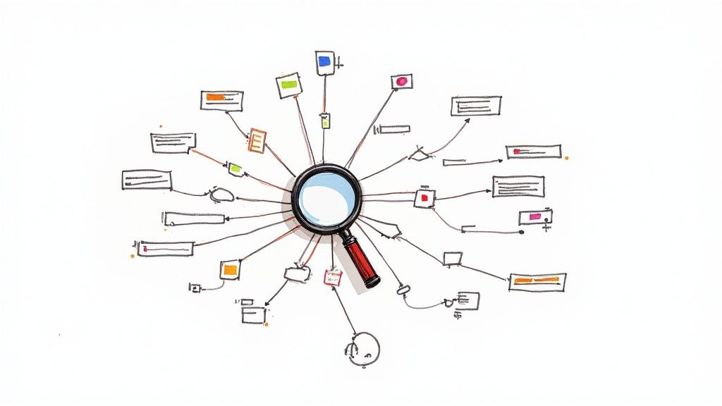
9. Findability
Findability, simply put, is the ease with which users can find what they're looking for within a website, app, or any other information system. It's a critical principle of information architecture because a user's ability to locate information directly impacts their satisfaction and the success of the platform. If users can't find what they need, they'll likely abandon the site, leading to lost conversions, decreased engagement, and ultimately, a failed product.
Findability hinges on the seamless integration of several key features:
- Well-structured navigation systems: Intuitive navigation menus, breadcrumbs, and sitemaps guide users through the information hierarchy, allowing them to browse and discover content systematically.
- Effective search functionality: A robust search engine with relevant results and features like auto-complete, spell-check, and advanced filtering options empowers users to quickly pinpoint specific information.
- Clear labeling and metadata: Descriptive labels, tags, and metadata provide context and improve the searchability of content, both by users and search engines.
- Strategic use of links and cross-references: Internal links connect related pieces of content, creating a web of information that allows users to explore deeper into topics and discover related resources.
- Logical content organization: Grouping related content together in a logical and predictable manner makes it easier for users to browse and locate information based on their mental models.
Examples of Successful Implementation:
- Google: Its advanced search algorithms, filters, and features like "knowledge panels" exemplify powerful findability, allowing users to retrieve highly specific information from a vast index of web pages.
- Amazon: Faceted navigation allows users to filter products based on various attributes (price, brand, size, etc.), significantly improving the discoverability of desired items within a massive product catalog.
- Wikipedia: Its comprehensive internal linking structure allows users to easily jump between related articles, fostering exploration and deeper understanding of interconnected topics.
Actionable Tips for Improved Findability:
- Implement both browsing and searching: Provide multiple pathways to information. Browsing caters to exploratory behavior, while searching addresses targeted needs.
- Use consistent, user-centered terminology: Employ language that resonates with your target audience in labels, menus, and metadata. Avoid jargon or technical terms they might not understand.
- Consider implementing faceted navigation: For e-commerce sites or platforms with complex information architectures, faceted navigation empowers users to refine search results based on specific criteria.
- Regularly analyze search logs: Identify common search terms and any findability gaps. This data can inform improvements to navigation, labeling, and content organization.
Pros & Cons of Prioritizing Findability:
Pros:
- Reduces user frustration and abandonment
- Increases content utilization and value
- Improves overall user satisfaction
- Supports both browsing and directed search behaviors
Cons:
- Requires ongoing maintenance as content evolves
- May require significant investment in search technology
- Needs a balance between comprehensive access and information overload
Why Findability Deserves Its Place in the List:
Findability is a foundational element of good user experience. In the crowded digital landscape, users have little patience for websites or apps that make it difficult to find information. Prioritizing findability ensures that your content is easily discoverable and accessible, leading to increased engagement, improved user satisfaction, and ultimately, the achievement of your business objectives. It's a crucial consideration for anyone involved in designing and developing digital experiences, from freelance web designers to startup founders. By implementing the principles and tips outlined above, you can create intuitive and user-friendly platforms that empower users to find what they need quickly and efficiently. Inspired by experts like Peter Morville (Ambient Findability), Lou Rosenfeld (Search Analytics for Your Site), and Marcia Bates (berrypicking model of information seeking), focusing on findability is an investment that yields substantial returns in user satisfaction and business success.
10. Context
Context is a crucial principle of information architecture (IA) that emphasizes the interconnectedness of business goals, user needs, and content requirements. It provides a holistic framework for designing effective and sustainable information systems by considering these three core dimensions: business context, user context, and content context. Ignoring any of these dimensions can lead to IA solutions that are either unusable, unsustainable, or fail to meet business objectives. This is why understanding and incorporating context deserves its place as a foundational IA principle.
How it Works:
The principle of context encourages IA practitioners to analyze and understand the specific environment in which the information system will operate. This involves:
- Business Context: This encompasses the organization's goals, internal politics, culture, available technology, resources, budget constraints, and any regulatory requirements. Understanding the business context ensures the IA solution aligns with the organization's overall strategy and is achievable within its limitations.
- User Context: This focuses on the target audience's needs, tasks, behaviors, vocabulary, mental models, and information-seeking patterns. A deep understanding of the user context is crucial for creating user-centered designs that are intuitive and meet user expectations.
- Content Context: This involves analyzing the existing content's volume, format, structure, governance processes, and lifecycle. Understanding the content context helps inform decisions about content organization, navigation, and management.
Features:
- Business context: Goals, politics, culture, technology, resources, constraints
- User context: Audience needs, tasks, behaviors, vocabularies, mental models
- Content context: Volume, format, structure, governance, lifecycle
Benefits (Pros):
- Balanced Solutions: Creates solutions that effectively serve the needs of multiple stakeholders – businesses, users, and content managers.
- Prioritization Framework: Provides a framework for resolving competing priorities and making informed trade-offs.
- Sustainability: Ensures IA solutions are realistic, sustainable, and adaptable to future changes.
- Foresight: Helps anticipate future challenges and opportunities by considering the dynamic nature of each context.
Challenges (Cons):
- Research Intensive: Requires extensive research and analysis across multiple domains.
- Potential Conflicts: May reveal conflicts between business goals and user needs that require careful negotiation.
- Balancing Act: Can be difficult to balance all three contexts equally, requiring prioritization based on specific circumstances.
Examples of Successful Implementation:
- Mayo Clinic: Balances the need to provide comprehensive medical information with business goals related to patient engagement and brand building.
- Financial Services Websites: Balance regulatory requirements for disclosure and security with the need to provide user-friendly online banking experiences.
- University Websites: Cater to diverse audiences (students, faculty, alumni, prospective students) with varying content needs and technical skills.
- E-commerce Platforms: Balance merchandising strategies and promotional activities with a seamless and intuitive user experience.
Actionable Tips:
- Document Assumptions: Clearly document assumptions and constraints related to each context dimension.
- Stakeholder Maps: Create stakeholder maps to thoroughly understand the business context and identify key decision-makers.
- User Personas: Develop user personas that capture key aspects of the user context, such as demographics, goals, and pain points.
- Content Audits: Conduct thorough content audits to understand the content context fully, including content inventory, gaps, and redundancies.
- Evaluation Framework: Use the three contexts as a framework for evaluating proposed IA solutions and ensuring alignment.
When and Why to Use This Approach:
The principle of context should be applied throughout the entire IA design process, from initial planning and research to implementation and evaluation. It's particularly important when:
- Developing new websites or applications.
- Redesigning existing information systems.
- Creating complex information architectures with multiple audiences and content types.
- Working in regulated industries with strict compliance requirements.
By considering the interplay of business, user, and content contexts, IA practitioners can create information systems that are not only user-friendly but also aligned with organizational goals and sustainable in the long term. This holistic approach ensures that IA solutions are both effective and relevant within their specific operating environment.
Information Architecture Principles: 10-Point Comparison
| Principle | Implementation Complexity 🔄 | Resource Requirements ⚡ | Expected Outcomes 📊 | Ideal Use Cases 💡 | Key Advantages ⭐ |
|---|---|---|---|---|---|
| Principle of Least Effort | Low; simple design but needs user testing | Minimal design effort with iterative usability insights | Enhanced ease-of-use and higher task completion rates | Systems prioritizing intuitive, minimal interactions | Intuitive navigation; reduced cognitive load |
| Progressive Disclosure | Moderate; requires step-wise planning | Additional design iterations and testing for logical progression | Reduced cognitive load and focused interaction experiences | Multi-step processes and complex decision paths | Cleaner interfaces; context-sensitive info delivery |
| Organizing Principle | Moderate to high; demands thorough research | Substantial user research and content categorization effort | Improved findability and predictable navigation | Large-scale systems with extensive content; libraries | Logical grouping and structured content organization |
| Information Scent | Moderate; clear labeling and testing required | Continuous user research and iterative refinements | Enhanced navigation efficiency and lower user frustration | Content-rich environments needing intuitive path cues | Clear cues that guide users toward relevant content |
| Mental Models Alignment | High; extensive user research and validation needed | Significant design iteration and stakeholder input | Intuitive, familiar interfaces that reduce learning curves | Systems where aligning with user expectations is critical | High trust; natural, predictable navigation |
| Principle of Focused Navigation | Moderate; balancing consistency with context can be challenging | Design resources focused on contextual adaptations and clarity | Efficient, goal-oriented navigation with fewer errors | Complex information systems with multiple navigation layers | Clear orientation and reduced user disorientation |
| Information Hierarchy | Moderate; requires careful visual and structural balance | Skilled design and typographic expertise | Prioritized, scannable content leading to better information retention | Content-dense sites (e.g., news, product pages) | Visual distinction and clear content prioritization |
| The Eight Principles of Information Architecture | High; comprehensive framework with interrelated elements | Significant strategic planning and ongoing evaluation | Robust, adaptable frameworks supporting diverse requirements | Enterprise-level or evolving systems with complex content needs | Holistic guidance covering structure, policy, and process |
| Findability | Moderate; needs refined search and link strategies | Ongoing technical and content maintenance investment | Easily locatable content with improved user engagement | Content-rich websites and databases requiring efficient navigation | Reduced frustration; accelerated information access |
| Context | High; balancing multifaceted needs is complex | Extensive cross-functional research and continuous stakeholder input | Sustainable solutions that align business, user, and content goals | Multifaceted systems addressing varied stakeholder demands | Holistic balance across business, user, and content requirements |
IA: The Cornerstone of Client Success
From the principle of least effort to maintaining clear information scent, the core tenets of information architecture discussed in this article provide a roadmap for creating intuitive and user-friendly digital experiences. By understanding concepts like progressive disclosure, focused navigation, and aligning with user mental models, you can transform a website from a collection of pages into a seamless, engaging journey. Mastering these principles, including the eight pillars of IA, and prioritizing findability within proper context, empowers you to build websites that not only look good but also perform well, driving conversions and fostering client loyalty. This translates directly into tangible benefits: increased user engagement, improved SEO performance, and ultimately, a higher return on investment. Implementing strong IA isn't just about ticking boxes; it's about investing in long-term success for both your clients and your own business. By weaving these principles into your design process, you're not just building websites, you're crafting strategic solutions that deliver measurable results.
Ready to take your IA analysis to the next level and unlock valuable insights for your client projects? A streamlined website audit with Roast My Web can identify areas for improvement based on these crucial information architecture principles, helping you create truly user-centered digital experiences. Get started today and see the difference a robust IA strategy can make.