Landing Page Anatomy: Unlock Conversion Secrets
Unlocking the Power of Landing Pages
Want higher conversion rates? Mastering landing page anatomy is key. This listicle breaks down the 8 essential elements of a high-converting landing page in 2025. Learn how strategic placement of your hero section, navigation, benefits, social proof, features, pricing, call-to-actions (CTAs), and footer can significantly impact visitor behavior. Optimizing each component of your landing page anatomy translates directly into more leads, sales, and ultimately, business growth. Let's dive in.
1. Hero Section
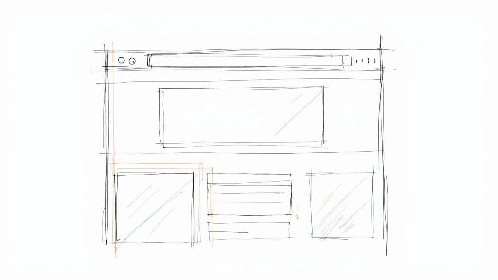
The hero section is the first visual element visitors see when they land on a page. It's the digital equivalent of a storefront window display and a critical component of effective landing page anatomy. Typically spanning the full width of the screen and positioned at the top, it serves as the initial impression and should immediately communicate the core value proposition of your product or service. This section plays a crucial role in engaging visitors and encouraging them to explore further down the page. It's the stage where you make your first, and often most impactful, statement.

The hero section generally includes several key features designed to capture attention and drive action. These include an eye-catching headline that succinctly communicates your unique value proposition, a supporting subheadline that elaborates on the headline and provides further context, and a high-quality background image or video that visually reinforces your message. Crucially, it incorporates a primary call-to-action (CTA) button, prompting users to take the desired next step, such as signing up for a trial or browsing products. Some hero sections also feature a secondary CTA, offering an alternative action like watching a demo video or downloading a resource.
Examples of Successful Hero Sections:
- Slack: Slack's homepage boasts a clean hero section with a clear, concise headline focusing on the benefits of improved team communication and engaging animated visuals.
- Airbnb: Airbnb utilizes a captivating background image of stunning travel destinations within its hero section, along with a prominent search bar, encouraging users to immediately begin exploring accommodation options.
- Stripe: Stripe's hero section leverages a subtly animated background and clear product positioning, highlighting its role in facilitating online payments for businesses.
Pros:
- Creates immediate visual impact: A well-designed hero section grabs attention and sets the tone for the entire landing page experience.
- Clearly communicates what the business/product offers: It concisely presents the core value proposition, ensuring visitors understand what you do at a glance.
- Establishes brand identity quickly: Visual elements and messaging contribute to conveying your brand personality and values.
- Guides users toward desired conversion actions: Strategically placed CTAs prompt users to take specific actions, driving conversions.
Cons:
- Can increase page load time: Using large images or videos can negatively impact loading speed if not properly optimized.
- May push important content below the fold: An overly large hero section can force valuable information further down the page, potentially reducing visibility.
- May become generic if not properly differentiated: Failing to stand out from competitors can make your hero section blend in with the crowd.
Tips for Creating a High-Converting Hero Section:
- Keep the headline brief (ideally under 10 words) and focused on benefits: Clearly and concisely articulate the value you provide to the user.
- Ensure CTAs have high contrast and clear action verbs: Make your buttons stand out and use action-oriented language (e.g., "Get Started," "Learn More").
- Test different hero variations to optimize conversion rates: A/B testing different headlines, visuals, and CTAs can significantly improve performance.
- Consider responsive design to ensure the hero looks good on all devices: Your hero section should adapt seamlessly to different screen sizes.
- Use high-quality, optimized images to maintain fast loading speeds: Compress images and leverage appropriate file formats to minimize load times.
Why the Hero Section Deserves Its Place: The hero section is the first and arguably most crucial element of landing page anatomy. It sets the stage, grabs attention, and guides the user journey. Its effectiveness directly impacts bounce rates, conversion rates, and overall user experience. By carefully crafting a compelling hero section, you significantly increase the chances of achieving your landing page goals. Its prominent placement and function are directly inspired by successful implementations by companies like Apple in their product launch pages, Hubspot's marketing website, and modern SaaS companies like Salesforce, Mailchimp, and Asana. They understood early on the power of grabbing attention and driving action immediately upon page load. This approach remains vital for landing page success today.
2. Navigation Bar
The navigation bar (navbar) is a critical element of landing page anatomy, guiding users through the website and influencing their journey towards conversion. While websites often feature complex navigation menus, landing pages typically employ a streamlined approach. This minimalist design prioritizes essential links and minimizes distractions, steering visitors toward the desired action, whether it's signing up for a newsletter, requesting a demo, or making a purchase. A well-designed navigation bar balances providing necessary information access with maintaining focus on the primary conversion goal.
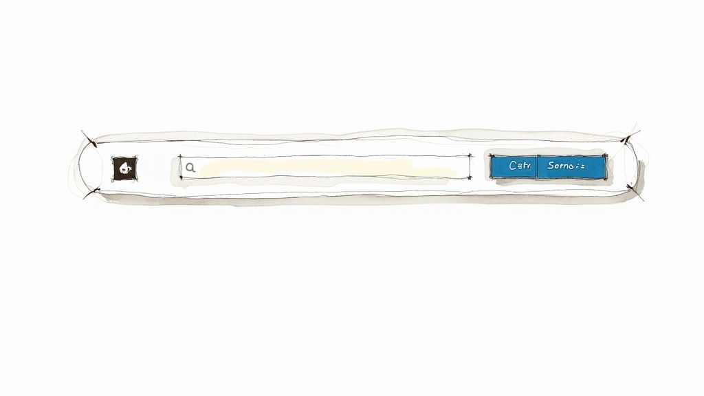
A landing page navigation bar commonly includes a logo or brand identifier on the left, reinforcing brand identity and providing a visual anchor. The menu itself contains minimal items directly relevant to the landing page's purpose, such as "Features," "Pricing," or "About Us." A call-to-action (CTA) button is frequently incorporated within the navbar, typically positioned in the right corner for prominent visibility. This allows users to readily convert regardless of their scroll position on the page. For longer landing pages, sticky or fixed navigation is prevalent. This keeps the navbar visible as users scroll, ensuring persistent access to key information and the CTA. Finally, responsiveness is paramount. Landing page navigation must adapt seamlessly to different screen sizes, often utilizing a hamburger menu on mobile devices to condense the navigation into a compact, user-friendly format. Learn more about Navigation Bar for a deeper dive into website UX best practices.
Features of an Effective Landing Page Navigation Bar:
- Logo/Brand Identifier: Located on the left for immediate brand recognition.
- Minimal Menu Items: Only essential links relevant to the landing page's goal.
- CTA Button: Often integrated into the navbar for easy access.
- Sticky/Fixed Positioning: Remains visible as the user scrolls down the page.
- Mobile Responsiveness: Adapts to different screen sizes, often using a hamburger menu for mobile.
Pros:
- Essential Navigation: Provides access to key information without requiring users to leave the landing page.
- Brand Reinforcement: Prominently displays the logo, reinforcing brand identity.
- Quick Access to Critical Information: Offers easy access to important details like pricing, features, and contact information.
- Improved UX: Sticky navigation enhances user experience, especially for longer landing pages.
Cons:
- Reduced Conversion Rates: Each additional navigation item can potentially distract users and decrease conversions.
- Competition with Primary CTA: Navigation elements can compete with the main CTA for attention.
- Exit Paths: May introduce opportunities for users to exit the conversion funnel.
Examples: Companies like Shopify, Zoom, and Unbounce demonstrate effective landing page navigation. Shopify uses minimal navigation with a clear logo, a few essential links, and a prominent sign-up CTA. Zoom focuses on solutions and pricing, while Unbounce showcases a clean navigation design with a high-contrast CTA button.
Tips for Optimizing Your Landing Page Navigation:
- Limit Navigation Items: Keep the number of navigation items to five or fewer.
- Consider Removing Navigation: For high-stakes conversion pages, consider removing navigation altogether to maximize focus on the CTA.
- Visual Distinction for CTA: Make the primary CTA visually distinct from other navigation elements.
- Test Sticky vs. Static Navigation: A/B test sticky and static navigation to determine which performs better for your specific audience and landing page.
- Ensure Dropdown Functionality: If using dropdown menus, ensure they don't obscure important content on the page.
The navigation bar plays a pivotal role in landing page anatomy. By understanding its function and optimizing its design, you can significantly impact user experience and drive conversions. This makes it a vital component for freelance web designers, digital marketing agencies, startup founders, solo entrepreneurs, and UX/UI specialists alike.
3. Benefits Section
The Benefits Section is a crucial part of landing page anatomy, serving as the bridge between your product's features and the value they provide to the user. It's where you translate technical jargon into tangible advantages, addressing customer pain points and painting a picture of how their lives will improve by using your product or service. This section answers the all-important question: "What's in it for me?" It takes the "what" of your features and transforms it into the "why" for your potential customers.
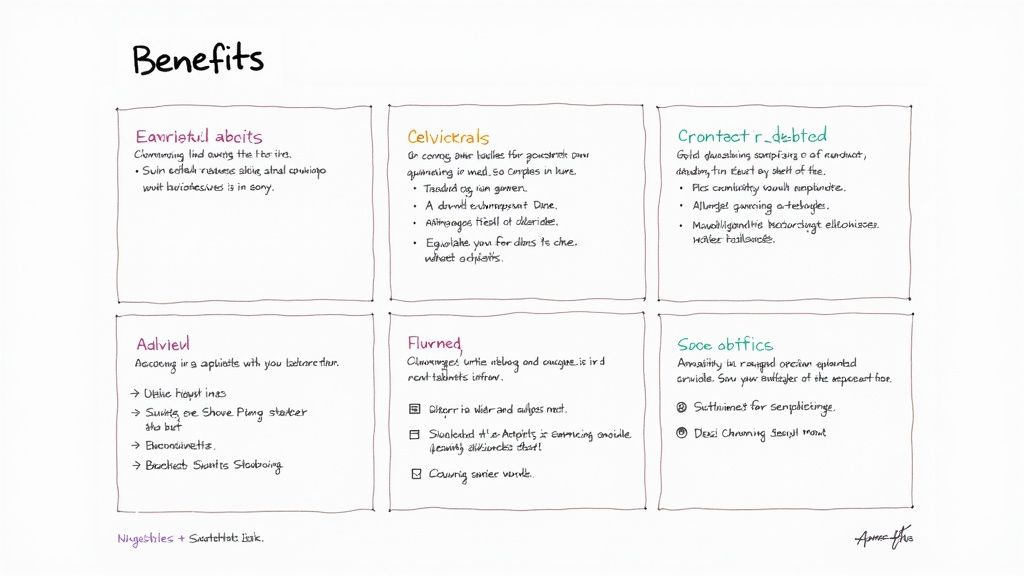
A well-crafted Benefits Section typically features a clear heading (e.g., "Key Benefits," "Why Choose Us?"), visually appealing icons or illustrations representing each benefit, concise benefit headlines focused on outcomes (e.g., "Boost Your Productivity," "Increase Sales by 20%"), and brief explanatory text elaborating on each benefit. These are often arranged in a visually appealing grid of 3-4 columns or rows. Supporting statistics or social proof can further enhance credibility and impact. For example, instead of just stating "Improved Efficiency," you could add "Boost team efficiency by 15% based on internal testing."
Examples of Successful Implementation:
- Trello: Effectively highlights productivity, flexibility, and visibility as key benefits, appealing to teams and individuals seeking better project management.
- Evernote: Showcases organization, collaboration, and synchronization benefits, resonating with users needing a powerful note-taking and information management solution.
- Monday.com: Utilizes a highly visual benefits section with animated illustrations to engage users and showcase the platform's versatility.
- Apple: Has long popularized this approach with their iconic "Why Mac/iPhone" sections, focusing on user experience and lifestyle benefits.
Pros:
- Translates technical features into tangible customer value.
- Addresses different customer motivations and pain points.
- Breaks down complex offerings into easily digestible chunks.
- Supports and reinforces the value proposition established in the hero section.
Cons:
- Can become generic and ineffective if benefits aren't specific and differentiated from competitors.
- May overwhelm users if too many benefits are presented, diluting the impact of each.
- Requires ongoing A/B testing to determine which benefits resonate most with your target audience.
Actionable Tips:
- Focus on 3-5 core benefits: Avoid overwhelming users with an exhaustive list. Prioritize the most impactful advantages.
- Lead with the benefit, not the feature: Frame benefits in terms of user outcomes. For example, "Save 10 hours weekly" is more compelling than "Automated reporting."
- Use consistent visual style: Ensure icons or illustrations share a cohesive aesthetic for a professional and polished look.
- Consider benefit hierarchy: Based on customer research, prioritize the order in which benefits are presented, placing the most compelling ones first.
- Test different benefit statements: A/B test variations of your benefit copy to optimize for maximum resonance with your target audience.
When and Why to Use This Approach:
The Benefits Section is essential for virtually any landing page aiming to convert visitors into customers. It's particularly valuable for products or services with complex features or those requiring users to understand the value proposition beyond surface level. This section deserves its place in landing page anatomy because it directly addresses customer needs and motivates them to take action. For freelance web designers, agencies, startup founders, and UX/UI specialists, crafting a compelling Benefits Section is key to demonstrating the value of their offerings and driving conversions.
4. Social Proof Section
The Social Proof Section is a crucial element of effective landing page anatomy. It leverages the psychological principles of social influence, popularized by Robert Cialdini's work on persuasion, to build credibility and trust with potential customers. By showcasing evidence that others have used and benefited from your product or service, you reduce perceived risk and validate your value proposition. This is particularly important for freelance web designers, digital marketing agencies, startup founders, solo entrepreneurs, and UX/UI specialists who need to quickly establish trust with their target audience. This section essentially answers the question, "Why should I trust you?" using the voices of satisfied customers and quantifiable results.
This section deserves its place in the landing page anatomy because it directly addresses a key psychological barrier to conversion: trust. Features within a Social Proof Section can include:
- Customer Testimonials with Photos and Names: Adding a face and name to a positive experience makes the testimonial more relatable and believable.
- Client Logos from Recognizable Companies: Showcasing logos of well-known clients instantly elevates your brand's perceived credibility.
- Star Ratings and Review Counts: These offer a quick and easily digestible overview of customer satisfaction.
- Case Study Summaries or Success Metrics: Quantifiable results, like increased conversion rates or cost savings, provide concrete evidence of your product's value.
- User Statistics (e.g., 'Trusted by X million users'): Demonstrates the wide-spread adoption and popularity of your offering.
- Media Mentions and Awards: Third-party validation from reputable sources adds another layer of trust.
Pros:
- Builds trust through third-party validation: Social proof relies on the inherent human tendency to follow the lead of others.
- Reduces perceived risk in decision-making: Testimonials and positive reviews help alleviate concerns and objections.
- Demonstrates real-world application and results: Case studies and success metrics showcase the tangible benefits of your product or service.
- Can address specific objections through targeted testimonials: Strategically chosen testimonials can directly refute common concerns.
Cons:
- Generic testimonials without specific results may lack credibility: Vague praise like "great product!" offers little value.
- Overuse of logos without context provides limited value: Simply displaying logos without explaining the relationship can appear superficial.
- Requires continuous updating to remain current and relevant: Outdated testimonials and statistics lose their impact.
Examples of Successful Implementation:
- Slack: Features customer stories from recognizable companies like Airbnb and Target, highlighting how their product improves team communication and collaboration.
- HubSpot: Showcases customer success metrics alongside testimonials, providing quantifiable proof of their marketing software's effectiveness.
- Shopify: Displays the number of businesses using their platform along with success stories, demonstrating the scale and impact of their e-commerce solution.
- Amazon: Leverages its extensive review system, allowing users to rate and review products, influencing purchasing decisions significantly.
Actionable Tips for Implementation:
- Use specific, results-oriented testimonials rather than generic praise: Focus on quantifiable achievements and tangible benefits.
- Include photos and full names to increase credibility: Humanize the testimonials and make them more relatable.
- Feature recognizable brands when possible, but ensure relevance to target audience: Relevance is key; featuring a Fortune 500 company is less impactful for a small business audience than a successful local business.
- Rotate testimonials to highlight different use cases and customer segments: Showcase the versatility of your product and resonate with various buyer personas.
- Place social proof strategically near high-friction conversion points: Address concerns and build confidence right before asking for the sale, such as near call-to-action buttons or signup forms.
By strategically implementing a Social Proof Section on your landing page, you can significantly enhance your credibility, reduce visitor hesitation, and ultimately drive conversions. This section is a cornerstone of effective landing page anatomy, leveraging the power of social influence to persuade and convert potential customers.
5. Features Breakdown
A critical component of effective landing page anatomy is the Features Breakdown section. This section provides a detailed explanation of your product or service's capabilities, moving beyond the broader benefits highlighted earlier on the page. While benefits address the "why," the Features Breakdown answers the "what." It dives deep into the specific functionalities and characteristics, offering visitors – particularly analytical decision-makers – a comprehensive understanding of what they're getting. This makes it a crucial element of landing page anatomy.
For audiences like freelance web designers, digital marketing agencies, startup founders, solo entrepreneurs, and UX/UI specialists, a well-crafted Features Breakdown can be highly persuasive. It demonstrates product sophistication and thought leadership, addressing specific use cases and scenarios that resonate with their professional needs. This granular level of detail can be particularly effective for complex products or services where a high level of due diligence is expected.
Here's a breakdown of how to effectively implement a Features Breakdown within your landing page anatomy:
Features of a Strong Features Breakdown:
- Detailed descriptions of key product capabilities: Go beyond simple bullet points. Provide clear, concise explanations of each feature and its functionality.
- Visual representations: Utilize screenshots, illustrations, videos, and even interactive elements like sliders or animations to showcase the features in action.
- Organized structure: Employ tabs, accordions, or sequential blocks to present information in a digestible format. This improves navigation and allows users to easily find the information they need.
- Technical specifications (when relevant): Include technical details for users who require them, but ensure they are presented in a clear and understandable manner.
- Competitive advantages: If applicable, highlight how your features compare to competitors, showcasing your unique selling propositions.
Pros:
- Satisfies the need for detailed information for analytical decision-makers
- Demonstrates thought leadership and product sophistication
- Addresses specific use cases and scenarios
- Can improve SEO through detailed content about product capabilities (optimize for keywords related to your product and "landing page anatomy")
Cons:
- Can overwhelm users if presented too early in the page – consider placement after benefits and call to action.
- May focus too much on 'what it is' rather than 'why it matters' – always tie features back to user benefits.
- Requires regular updates to stay current with product development – ensure your Features Breakdown remains accurate.
Examples of Successful Implementation:
- Ahrefs: Provides a detailed breakdown of its SEO tool features with screenshots, allowing potential users to understand exactly how the platform works.
- Adobe Creative Cloud: Offers an interactive feature showcase, allowing users to explore the different applications and their capabilities in a visually engaging way.
- Tesla: Utilizes interactive feature highlights on their product pages, allowing potential buyers to explore different models and their features in detail.
Actionable Tips for Implementation:
- Organize features into logical categories or user needs: Group similar features together to make it easier for users to find what they are looking for.
- Use visual hierarchy to differentiate between primary and secondary features: Highlight key features prominently and use visual cues like size, color, and placement to draw attention to them.
- Include contextual examples showing features in action: Show users how the features can be used in real-world scenarios.
- Consider progressive disclosure techniques to avoid overwhelming users: Start with a high-level overview and allow users to drill down for more details as needed. Learn more about Features Breakdown and information architecture principles to effectively structure this section.
- Balance technical details with explanations of practical applications: Provide enough technical information to satisfy analytical users, but also explain how these features translate into tangible benefits.
By following these guidelines, you can create a Features Breakdown section that effectively communicates the value of your product or service, strengthens your landing page anatomy, and drives conversions.
6. Pricing Section
A crucial element of effective landing page anatomy is the pricing section. This section presents the cost structure of your products or services in a clear, compelling format that not only communicates costs but also reinforces value, addresses potential objections, and guides users toward the optimal plan for their needs. Its strategic placement and design contribute significantly to conversion rates. A well-crafted pricing section is essential for any landing page aiming to convert visitors into paying customers, making it a vital component of landing page anatomy.
How a Pricing Section Works:
The pricing section typically showcases different pricing tiers, often presented as columns or cards, allowing for easy comparison. Each tier clearly displays the price point along with the billing frequency (e.g., monthly, annual). Feature comparison tables or bullet points within each tier highlight the differences between options, enabling users to self-select the best fit. A visually prominent highlight often indicates the recommended or most popular plan. Frequently Asked Questions (FAQs) address common pricing inquiries, and information about money-back guarantees or free trials builds trust and encourages sign-ups. Often, options for enterprise or custom pricing are included to cater to larger or specialized clients.
Examples of Successful Implementation:
- Mailchimp: Utilizes a sliding scale pricing model based on subscriber count, allowing flexibility for businesses of all sizes.
- Zoom: Offers straightforward tiered pricing with a clear feature comparison table, making it easy to choose the right plan.
- Notion: Employs simplified pricing with free, personal, and team options, catering to a wide range of users.
Actionable Tips for Creating Effective Pricing Sections:
- Highlight Value: Emphasize the best value or most popular option to guide users towards a preferred choice.
- Consistent Descriptions: Use clear, consistent feature descriptions across all tiers to avoid confusion.
- Test Pricing Display: Experiment with the impact of displaying monthly vs. annual pricing to see what resonates best with your target audience.
- Address Objections: Include microcopy to address common objections proactively. For example, "Cancel anytime" next to the pricing can alleviate concerns about commitment.
- Interactive Calculators: Consider interactive pricing calculators for complex pricing models to personalize the experience.
- Mobile Responsiveness: Ensure the pricing table is fully responsive and displays correctly on all devices.
When and Why to Use a Pricing Section:
A pricing section is indispensable for any landing page selling a product or service. It should be positioned strategically, typically after the value proposition and key features have been clearly communicated. Avoid placing it too early in the page, as this may deter users before they understand the value you offer.
Pros of a Well-Designed Pricing Section:
- Transparency: Openly displaying pricing builds trust with potential customers.
- Segmentation: Tiered options cater to different customer segments and their varying needs.
- Self-Selection: Highlighting plan differences empowers users to choose the most appropriate option.
- Strategic Pricing Psychology: Techniques like anchoring can be used to influence perceived value.
Cons to Consider:
- Early Placement Deterrent: Positioning the pricing section too early on the landing page may discourage some users.
- Complexity: Overly complex pricing structures can create friction and lead to abandonment.
- Price Sensitivity: Price sensitivity varies significantly across different markets and customer segments.
Who Popularized This:
SaaS companies like Salesforce and HubSpot have played a significant role in establishing best practices for pricing sections. Pricing psychology experts like Nick Kolenda have further refined the approach. Subscription-based services across numerous industries have adopted these strategies.
By following these tips and considering the examples provided, you can create a pricing section that effectively communicates value, addresses objections, and ultimately drives conversions on your landing page. This section is a cornerstone of landing page anatomy for any business seeking to acquire and retain customers online.
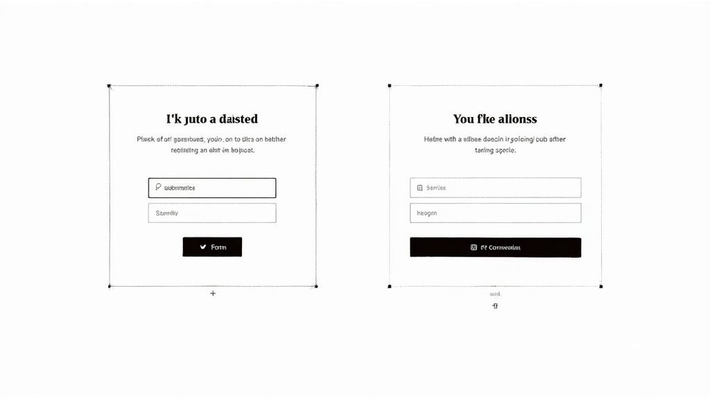
7. Call-to-Action (CTA) Sections
Call-to-Action (CTA) sections are crucial components of effective landing page anatomy. They are the strategic points designed to convert a visitor's passive interest into tangible actions, ultimately driving conversions. While your landing page hero section likely features a prominent CTA, a truly optimized landing page leverages multiple CTA touchpoints strategically placed throughout its length. These CTAs are timed to capture user interest as they progressively learn more about your offering, guiding them toward the desired conversion. Think of them as signposts along the conversion highway, gently nudging visitors toward their final destination.
CTAs aren't just randomly placed buttons; they're carefully designed elements incorporating specific features to maximize their effectiveness. These features include high-contrast buttons with action-oriented text that immediately grabs the user's attention. Forms for lead generation are frequently integrated, allowing you to capture valuable user information. Visual cues, such as arrows or directional lines, draw the eye towards the action area. Often, CTAs are paired with final value reinforcement, reminding visitors of the benefits they'll receive by taking action. For example, highlighting the number of satisfied customers or offering a limited-time bonus. Finally, effective landing pages utilize both primary and secondary CTAs, catering to different user intentions and stages in the buying process.
Why CTA Sections Deserve Their Place in Landing Page Anatomy:
CTAs provide a clear path to conversion, essentially telling visitors what you want them to do next. By having multiple CTAs throughout the page, you cater to users at different stages of decision-making. Some might be ready to convert immediately, while others require more information before taking the plunge. This approach gives every visitor multiple opportunities to convert, maximizing your chances of success. Furthermore, different CTAs can be tailored to specific user motivations, further personalizing the experience. For instance, a "Learn More" CTA caters to those seeking further information, while a "Get Started Now" CTA targets those ready to commit.
Pros and Cons of Multiple CTAs:
Pros:
- Creates clear conversion paths for visitors.
- Catches users at different stages of decision readiness.
- Provides multiple opportunities to convert.
- Can be tailored to different user motivations.
Cons:
- Too many CTAs can overwhelm visitors and create decision paralysis.
- Poorly placed CTAs can disrupt the natural flow of information and feel intrusive.
- Overly aggressive CTAs can feel pushy and erode trust.
Examples of Successful Implementation:
- Hubspot: Masterfully uses contextual CTAs within their content sections, offering relevant resources and next steps based on the topic being discussed.
- Netflix: Keeps it simple with a strategically repeated "Start your free trial" CTA, ensuring it's always within easy reach.
- Salesforce: Employs multi-step CTAs, guiding users through the consideration stages with clear and concise calls to action.
Actionable Tips for Implementing Effective CTAs:
- Action-Oriented Verbs: Use verbs that clearly communicate the next step. "Start your free trial" is far more compelling than a generic "Submit."
- Visual Consistency and Contrast: Maintain visual consistency across your CTAs while ensuring they stand out from the surrounding content.
- Reduce Friction: Minimize form fields or use progressive disclosure to make the conversion process as seamless as possible.
- A/B Testing: Experiment with CTA placement, color, size, and copy to determine what resonates best with your audience.
- Above the Fold: Ensure at least one strong CTA is visible without scrolling.
- Value Reinforcement: Near your final CTAs, reinforce the value proposition by highlighting benefits, social proof, or limited-time offers (e.g., "Join 10,000+ businesses").
You can learn more about Call-to-Action (CTA) Sections and how they play a vital role in website conversion optimization. This resource provides valuable insights for freelance web designers, digital marketing agencies, startup founders, solo entrepreneurs, and UX/UI specialists looking to enhance their landing page performance.
Digital marketing pioneers like Neil Patel and Rand Fishkin have long emphasized the importance of strong CTAs. Conversion optimization experts like Oli Gardner (Unbounce) have further refined the art of crafting compelling calls to action. And e-commerce giants like Amazon, with their distinctive "Add to Cart" buttons, exemplify the power of clear and consistent CTAs. By understanding the principles of effective CTA design and placement, you can significantly improve your landing page conversion rates and achieve your marketing goals.
8. Footer Section
The footer section, a crucial element of landing page anatomy, resides at the bottom of the page and provides supplementary information without detracting from the primary conversion goals. Think of it as the supporting cast to your landing page's star performer – the main content area. While less prominent, the footer plays a vital role in building trust, offering additional resources, and ensuring legal compliance, all contributing to a positive user experience. This makes it a key component of effective landing page design.
Unlike website footers, which often contain extensive sitemaps and numerous links, landing page footers are generally more streamlined. Their purpose is to provide essential information and address secondary user needs without pulling focus from the main call to action.
Features of an Effective Landing Page Footer:
- Legal Information: This includes essential links to your privacy policy and terms of service, ensuring compliance with regulations like GDPR and CCPA.
- Contact Information and Support Options: Providing an email address, phone number, or a link to a contact form builds trust and offers users a way to reach out for assistance.
- Secondary Navigation: Include links to less critical pages, such as "About Us" or "Careers," that might be relevant to some visitors but shouldn't distract from the main conversion goal.
- Trust Signals: Display security badges, certifications, or client logos to enhance credibility and reassure users about the safety and legitimacy of your business.
- Copyright Information and Year: This standard practice establishes ownership and contributes to a professional appearance.
- Secondary CTAs or Newsletter Signup: While less common, a secondary call to action, such as subscribing to a newsletter, can be effective in capturing leads who aren't ready to convert on the primary offer.
- Social Media Links and Sharing Options: These can extend your reach and encourage social engagement, but their effectiveness should be carefully tested as they can also distract users.
Pros:
- Provides necessary legal and trust information without cluttering the main content area.
- Offers additional navigation options for users seeking more detailed information.
- Creates a sense of completion and professionalism, contributing to a polished overall impression.
- Helps ensure compliance with legal requirements, protecting both your business and your users.
Cons:
- Can create exit paths, diverting users away from the primary conversion goals.
- May be overlooked by users who don't scroll to the bottom of the page.
- Excessive footer content can dilute the focus of the landing page and overwhelm visitors.
Examples of Effective Footers:
- Dropbox: Known for its clean and concise footer featuring essential links and a language selector.
- Zendesk: Utilizes an organized, columned layout to categorize links and provide easy access to various resources.
- Uber: Employs a minimalist approach, focusing only on the most essential information in its landing page footers.
Tips for Optimizing Your Landing Page Footer:
- Group Links by Category: Improve scannability and help users quickly find the information they need.
- Minimize Content on High-Stakes Landing Pages: For pages with a single, crucial conversion goal, keep the footer as streamlined as possible.
- Include Only Essential Trust Signals and Legal Information: Avoid overwhelming users with excessive badges or certifications.
- Consider a Sticky "Back to Top" Button: For long landing pages, this allows users to easily return to the main content.
- Test the Impact of Social Media Links: While potentially beneficial, social media links can also be distracting. A/B testing can determine their effectiveness.
- Ensure Mobile Optimization: Use appropriate tap target sizes and responsive design to guarantee a positive user experience on all devices.
Why the Footer Deserves Its Place in Landing Page Anatomy:
The footer serves as the final touchpoint for many users on your landing page. It's a valuable opportunity to build trust, provide essential information, and guide users towards further exploration while maintaining a streamlined and focused user experience. By strategically crafting your footer, you can enhance the overall effectiveness of your landing page and improve your chances of achieving your conversion goals. This element is essential for freelance web designers, digital marketing agencies, startup founders, solo entrepreneurs, and UX/UI specialists looking to create high-converting landing pages. It demonstrates attention to detail and reinforces professionalism, solidifying the landing page as a complete and trustworthy resource.
Landing Page Anatomy: 8-Section Comparison
| Element | Implementation Complexity (🔄) | Resource Requirements (⚡) | Expected Outcomes (📊) | Ideal Use Cases (💡) | Key Advantages (⭐) |
|---|---|---|---|---|---|
| Hero Section | Moderate – requires balancing media | High – quality visuals and optimized media | Immediate visual impact and clear value communication | Brand landing pages and conversion-focused sites | Strong first impression and clear conversion guidance |
| Navigation Bar | Low to Moderate – simple structure | Low – minimal design assets | Smooth navigation with minimal distraction from conversion goals | Websites needing essential navigation alongside CTAs | Clear brand identity and streamlined access to key info |
| Benefits Section | Moderate – organized layout | Moderate – custom icons and graphics | Conveys tangible value and translates features into benefits | Complex products that require clear articulation of value | Simplifies message with focused, outcome-based benefits |
| Social Proof Section | Moderate – requires integration of media and testimonials | Moderate – curated testimonials and logos | Increased trust and validation through real user feedback | Sites needing enhanced credibility and social validation | Leverages third-party influence for higher conversion rates |
| Features Breakdown | High – detailed, often interactive | High – extensive content and visuals | Provides comprehensive information and satisfies analytical users | Technical or feature-rich products needing in-depth detail | In-depth explanation with competitive differentiation |
| Pricing Section | Moderate – balanced presentation | Low to Moderate – clear, structured data | Builds transparency and helps customers self-select the right package | SaaS and subscription services with tiered pricing | Transparent cost structure with strategic plan differentiation |
| CTA Sections | Low to Moderate – multiple placements | Low – focused design elements | Drives conversions by offering multiple opportunities for action | Conversion-driven pages across various stages of the funnel | Multiple, strategically placed prompts to guide user action |
| Footer Section | Low – simple informational layout | Minimal – basic text and link assets | Completes the page with trust info and legal details | All landing pages where supplementary info is needed | Provides professional closure and essential compliance info |
Perfecting Your Landing Page Anatomy
Mastering landing page anatomy is more than just arranging elements; it's about strategically crafting an experience that guides visitors toward conversion. From the compelling hero section that grabs attention to the clear call to action that seals the deal, each component plays a vital role. We've explored the eight crucial elements: the hero section, navigation bar, benefits section, social proof section, features breakdown, pricing section, call-to-action sections, and the footer section. By optimizing each element, you create a cohesive and persuasive narrative that resonates with your target audience. Optimizing each element of your landing page is crucial for a positive user experience and increased conversions. For a deeper dive into creating high-converting landing pages, check out this helpful resource on landing page experience from Rep.ai.
These insights are your blueprint for building high-performing landing pages that don't just attract visitors but convert them into loyal customers. Remember, the most important takeaways are to prioritize clarity, maintain a consistent message, and always focus on providing value to your audience. By applying these principles and continually iterating based on data and user feedback, you'll be well on your way to creating landing pages that achieve your business goals.
Want to ensure your landing page anatomy is perfectly optimized for conversions? Roast My Web offers comprehensive audits to analyze your landing page design, UX, and adherence to conversion best practices. Get started today and transform your landing pages into powerful lead generation machines!