Landing Page Best Practices: Boost Your Conversion Today
Ready to Turn Clicks Into Customers?
Driving traffic to your website is essential, but it's only the first step. The real measure of success lies in what happens after the click. This is where the power of a high-converting landing page comes in. From the internet's early days to the data-driven strategies of 2025, landing page design has evolved significantly. What began as a simple online brochure has become a dynamic tool for personalized experiences, rigorous testing, and persuasive design, all geared towards guiding visitors to a specific action.
Understanding these evolving concepts is crucial for freelancers, agencies, startups, and entrepreneurs. Effective landing pages are more than just visually appealing; they're built on a foundation of user psychology, persuasive copywriting, and meticulous optimization. They consider the user's journey, anticipate their needs, and offer a compelling reason to convert. Success hinges on minimizing distractions, building trust, and motivating visitors to take the desired action.
In this article, we'll explore the best practices for creating landing pages that convert clicks into customers. We'll cover the core elements, from defining a clear value proposition to using the latest techniques in mobile optimization and personalization.
Building a High-Converting Landing Page: Key Elements
Let's break down some of the most important aspects of landing page design:
- Clear Value Proposition: Immediately communicate the benefit of your product or service. What problem does it solve for the visitor?
- Compelling Call to Action: Use a clear and concise call to action (CTA) that tells visitors what you want them to do (e.g., "Sign Up Now," "Get a Free Quote").
- Trust-Building Elements: Include social proof, testimonials, security badges, and guarantees to build credibility and trust.
- Mobile Optimization: Ensure your landing page is responsive and displays correctly on all devices. A seamless mobile experience is essential in today's mobile-first world.
- Personalization: Tailor your landing page content to specific audience segments whenever possible. This can significantly improve conversion rates.
By the end of this article, you’ll have a comprehensive understanding of how to build landing pages that not only attract visitors but also drive tangible results for your business.
1. Clear Value Proposition
A compelling value proposition is essential for any successful landing page. It's a concise statement explaining how your product or service solves a customer's problem, delivers specific benefits, and sets you apart from the competition. On landing pages, this means communicating your core offer within seconds. Why is this so crucial? Because online, you have only a few moments to grab a visitor’s attention. Without a clear value proposition, visitors will likely leave, impacting your conversion rates.

A strong value proposition includes these key features:
- A headline that grabs attention and communicates the core benefit: This is your first impression, so make it impactful, concise, and easy to understand.
- A subheadline that expands on the headline with details: Provide more context and elaborate on the benefits.
- Visuals that reinforce the message: Images, videos, and graphics can communicate effectively and engage visitors.
- Concise, benefit-driven copy: Keep your language clear and focused on what the visitor gains.
A well-crafted value proposition offers numerous advantages:
- Shows visitors why they should care: It answers the question, "What's in it for me?"
- Reduces bounce rates: When visitors understand your value immediately, they are more likely to stay.
- Qualifies leads: It attracts customers genuinely interested in your offering.
- Sets clear expectations: Minimizes potential confusion by ensuring visitors understand what to expect.
However, crafting a winning value proposition presents some challenges:
- Simplifying complex offerings: Distilling complex features into digestible benefits can be difficult.
- Optimizing messaging: A/B testing is often needed to find the most effective wording and presentation.
- Avoiding generic messaging: You must highlight what makes your offering unique.
Real-World Examples of Effective Value Propositions
Real-world examples demonstrate the impact of a strong value proposition. Slack’s landing page headline, "Where work happens," concisely communicates its core benefit, with the subheadline further explaining how it replaces email for team communication. Airbnb uses the direct value proposition, "Book unique homes and experiences," instantly clarifying its offering. Unbounce states, "Build landing pages fast, get more conversions," emphasizing both speed and results.
Concepts like the value proposition were promoted by marketing experts like Peep Laja (CXL), Oli Gardner (Unbounce), and HubSpot's marketing team, who recognized its importance in online conversions. They highlighted the need for clarity, conciseness, and benefit-driven messaging.
Tips for Crafting a Winning Value Proposition
Here are some practical tips for creating an effective value proposition:
- Placement above the fold: Make it the first thing visitors see.
- Focus on benefits, not features: Explain what the features do for the customer.
- A/B testing: Experiment with different versions to find what works best.
- Message matching: Ensure consistency between the ad or link that brought visitors to the page and the message on the page.
- Use a formula: Try this framework: 'We help [target audience] to [solve problem] by [unique solution]'.
For more optimization tips, see our Website Audit Checklist, which covers various aspects of website optimization, including value proposition clarity.
2. Single Focused Call-to-Action (CTA)
A cluttered landing page with multiple competing calls-to-action can confuse visitors and diminish their attention. A single, focused call-to-action (CTA) is key for maximizing conversions. This strategy centers your landing page design on one clear conversion goal. It eliminates distractions and guides visitors toward the desired action, whether it's signing up for a newsletter, making a purchase, or downloading a resource.

Key Features of a Focused CTA
-
Visually Prominent Button or Form: The CTA should stand out as the most noticeable element on the page. Use contrasting colors and plenty of whitespace to draw attention.
-
Action-Oriented Text: Use verbs that encourage immediate action. Think "Get Started," "Download Now," or "Claim Your Free Trial." The text should clearly communicate the result of clicking.
-
Strategic Placement: Ideally, position the CTA "above the fold," meaning it's visible without scrolling. Consider placing it at other natural decision points throughout the page as well.
-
Consistent Messaging: The CTA’s message should align with the overall value proposition of the landing page, reinforcing the benefit of taking action.
Why a Single Focused CTA Is Best Practice
This approach simplifies the decision-making process for visitors, reducing decision fatigue. Presenting one clear path to conversion eliminates ambiguity and makes it easier for visitors to achieve their desired outcome (and yours!). A focused CTA also simplifies analytics and conversion tracking, enabling you to accurately measure and optimize your landing page's effectiveness for a single goal.
Pros and Cons of a Single Focused CTA
Here's a quick overview of the advantages and disadvantages:
| Pros | Cons |
|---|---|
| Reduces decision fatigue for visitors | May not suit users at different buyer journey stages |
| Creates a clear path to conversion | Can limit alternative conversion opportunities |
| Simplifies analytics and tracking | Requires careful selection of the most valuable conversion |
Real-World Examples
Several well-known companies utilize single, focused CTAs:
- Dropbox: Their "Sign up for free" CTA button is a classic example of a focused approach.
- Netflix: The prominent "Try 30 Days Free" button immediately communicates their core value and encourages a trial.
- Zoom: Zoom's landing page, featuring a singular "Sign Up, It's Free" CTA, effectively drives user registration.
Evolution and Popularization
The focused CTA has been advocated by marketing thought leaders like Oli Gardner (Unbounce) and Brian Halligan and Dharmesh Shah (HubSpot). MarketingSherpa case studies have repeatedly demonstrated the effectiveness of this approach in increasing conversion rates.
Practical Tips for Implementation
Here are some practical tips to consider:
- Use contrasting colors: Make the CTA button visually stand out.
- Test different CTA text: Experiment with variations like "Get Started" vs. "Sign Up Now" to find what works best.
- Repeat the CTA: Reintroduce the CTA as the user scrolls, providing multiple chances to convert.
- Use directional cues: Subtly guide visitors toward the CTA using arrows or images.
- Create urgency: Use words like "now" or "today" to encourage immediate action.
By implementing a single, focused CTA, you can streamline the user experience, improve conversion rates, and achieve your landing page goals more efficiently. This approach is a cornerstone of effective landing page design and essential for maximizing your online marketing impact.
3. Minimalist Design With Focus on Conversion

Grabbing a visitor's attention online is more challenging than ever. Minimalist landing page design offers a solution by prioritizing the essential: your core message and the desired conversion. This design philosophy uses simplicity, strategic white space, and visual hierarchy to guide users toward taking action. It's a key element of effective landing page best practices.
A minimalist design features a clean layout, ample white space, and minimal navigation. Carefully chosen imagery reinforces the message, and strategic color use highlights important elements. Streamlined forms with fewer fields reduce friction for visitors.
Benefits of Embracing Minimalism
- Improved Page Load Speed: Minimalist designs often mean smaller file sizes, leading to faster loading times. This is crucial, as slow page loads increase bounce rates.
- Reduced Cognitive Load: Clear and concise information presentation minimizes the mental effort needed to process content, creating a more enjoyable and effective user experience.
- Minimized Distractions: Eliminating clutter keeps visitors focused on the primary message and call to action, boosting conversion potential.
- Enhanced Mobile Performance: Minimalist designs adapt seamlessly to smaller screens, ensuring a consistent experience for mobile users.
- Focused User Experience: The streamlined design directs attention to key information, encouraging desired actions.
Potential Drawbacks
- Information Scarcity: For complex products requiring detailed explanations, minimalism might not provide enough information.
- Homogeneity: The popularity of minimalism can result in similar-looking designs, making it difficult to stand out.
- Increased Reliance on Copywriting: With less content overall, compelling and concise copy is essential for communicating value.
Real-World Examples
- Apple: Apple's product pages use concise text, impactful visuals, and white space to emphasize key features and benefits.
- Stripe: Stripe's homepage uses simple illustrations and focused content to clearly convey their value proposition.
- Wistia: Wistia's video landing pages minimize distractions, putting video content front and center.
Practical Tips for Implementation
- Remove Navigation Menus: Keep visitors focused on the conversion goal.
- Visual Hierarchy: Use size, color, and contrast to guide the user's eye to the call to action.
- Limited Color Palette: 2-3 primary colors plus neutrals maintain a clean and consistent aesthetic.
- Optimize for Speed: Aim for page loads under 3 seconds.
- Strategic Use of Negative Space: White space draws attention to key elements and creates visual breathing room.
Historical Context & Influence
Minimalist web design is influenced by user-centered design pioneers like Tim Ash (SiteTuners) and Jakob Nielsen (Nielsen Norman Group). The principles of Dieter Rams, emphasizing simplicity and functionality, also play a significant role.
You might be interested in: Our guide on Website Conversion Optimization to further enhance your understanding of boosting conversion rates.
By applying these minimalist design principles, you can create effective landing pages that drive conversions and achieve your business goals.
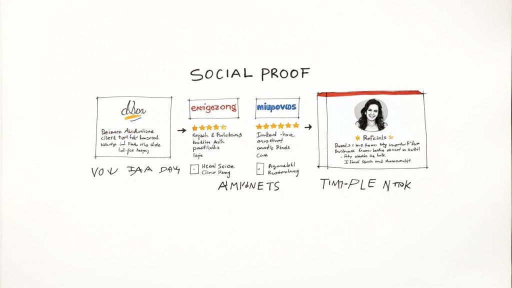
4. Social Proof Integration
Social proof is a powerful psychological principle that significantly impacts online behavior. On landing pages, it taps into our natural inclination to follow the lead of others. By showcasing positive experiences and endorsements, you can build trust, reduce visitor uncertainty, and ultimately, encourage conversions. This makes social proof a vital part of any successful landing page strategy.
The concept of social proof was popularized by Robert Cialdini in his influential book, Influence: The Psychology of Persuasion. He identified it as one of six key principles of persuasion. Its application in marketing has since been widely studied and refined by experts like Neil Patel and through resources like ConversionXL case studies.
Features of Effective Social Proof
- Customer Testimonials: Authentic testimonials with photos and real names create a strong connection with visitors.
- Trust Indicators: Displaying client logos (especially well-known brands), partner badges, and security seals enhances credibility.
- Review Integration: Integrating platforms like Google Reviews or Yelp offers unbiased validation.
- Case Studies: Detailed case studies demonstrate the value and impact of your product or service.
- User Statistics: Sharing impressive numbers (e.g., "Over 10,000 satisfied customers") reinforces positive perceptions.
- Social Media Engagement: Showcasing social media shares, likes, and follower counts adds another layer of validation, especially for younger demographics.
Pros of Using Social Proof
- Increased Credibility: Seeing others endorse your offering builds trust in your brand.
- Reduced Risk Perception: Testimonials and reviews alleviate potential customer concerns.
- Demonstrated Value: Social proof shows how your product or service benefits others.
- Objection Handling: Testimonials can directly address common hesitations.
Cons of Using Social Proof
- Risk of Inauthenticity: Fake or generic testimonials can damage credibility.
- Potential for Clutter: Too much social proof can overwhelm visitors.
- Maintenance Requirements: Outdated testimonials lose their impact and require regular updating.
- Negative Feedback Concerns: Low numbers or negative reviews can be detrimental.
Examples of Social Proof in Action
- Salesforce: Effectively uses client logos of recognizable brands like Adidas and Amazon on their landing pages.
- Basecamp: Uses real-time metrics like "3,333 companies signed up last week" to create urgency and show popularity.
- Slack: Leverages statistics like "65% of Fortune 100 companies use Slack" to establish market leadership.
Tips for Implementing Social Proof
- Targeted Testimonials: Use industry-specific testimonials for targeted landing pages.
- Quantifiable Results: Include specific results and metrics in testimonials whenever possible.
- Strategic Placement: Position social proof near forms, call-to-action buttons, or pricing to address potential hesitations.
- Video Testimonials: These offer higher engagement and convey emotion effectively.
- A/B Testing: Test different types of social proof to see what resonates with your audience.
- Regular Updates: Keep testimonials and statistics current to maintain their impact.
By strategically incorporating social proof on your landing pages, you can improve conversion rates and build a stronger brand reputation. It's a powerful tool for building trust and motivating potential customers to take action.
5. Mobile-First Responsive Design
Creating a landing page that works seamlessly on all devices is no longer a luxury, it's a necessity. With mobile traffic often surpassing desktop traffic, mobile-first responsive design is crucial. This design approach prioritizes smaller screens like smartphones, then adapts for larger displays. This ensures a positive user experience regardless of how someone accesses your site.
Key Features of Mobile-First Design
Mobile-first design incorporates specific elements to optimize the mobile experience:
- Fluid Grid Layouts: Content adapts dynamically to any screen size.
- Touch-Friendly Elements: Buttons and menus are designed for easy navigation on touchscreens.
- Simplified Content: Key information is prioritized, reducing clutter for mobile viewing.
- Fast Loading Times: Speed is essential for mobile users, especially on less stable connections.
- Progressive Enhancement: Additional features and complex layouts are added for larger screens as needed.
Advantages of Mobile-First
Adopting a mobile-first approach offers several significant benefits:
- Captures Mobile Users: Reaches the growing segment of mobile users effectively.
- Improves SEO: Aligns with Google's mobile-first indexing, benefiting your search rankings.
- Reduces Maintenance: A single responsive site simplifies updates across all devices.
- Future-Proofs Design: Ensures your landing pages remain relevant as mobile usage continues to grow.
- Focused Design: Leads to more concise and conversion-focused designs.
Potential Drawbacks
While mobile-first design offers numerous advantages, it's important to consider potential challenges:
- Development Complexity: Can be more complex than designing for desktop first.
- Limited Design Options: Certain desktop design elements might not translate well to mobile.
- Thorough Testing: Requires testing across a wide range of devices and browsers.
- Content Depth: Might require adjustments to content depth for optimal mobile display.
Real-World Examples
Several leading companies effectively utilize mobile-first design:
- Shopify: Known for fast loading speeds and high mobile conversion rates.
- Mailchimp: Offers responsive forms that maintain usability on all devices.
- Uber: A minimalist mobile-first approach provides a seamless experience across all screen sizes.
History and Influencers
The concept of "Mobile First" was popularized by Luke Wroblewski, while Ethan Marcotte championed responsive web design. Google's adoption of mobile-first indexing solidified its importance in web development.
Implementation Tips
Here are some practical tips for implementing a successful mobile-first strategy:
- Larger Touch Targets: Use touch targets of at least 44x44 pixels.
- Prioritize Page Speed: Compress images and minimize code.
- Vertical Stacking: Favor vertical layouts for mobile.
- Real Device Testing: Test on actual mobile devices for accurate usability insights.
- Thumb Zones: Place key elements within easy reach for one-handed use.
- Mobile-Friendly Test: Utilize Google's Mobile-Friendly Test to validate your design.
For more detailed guidance, check out this resource: Our guide on how to make your website mobile-friendly.
By prioritizing mobile users and implementing these best practices, you can create effective landing pages that drive conversions across all devices. This is why mobile-first responsive design remains a cornerstone of modern web development.
6. A/B Testing and Iterative Optimization
A/B testing, also known as split testing, is a cornerstone of successful landing page optimization. It's a data-driven approach that eliminates guesswork and helps you understand what truly resonates with your audience. By creating two or more versions of your landing page with variations in specific elements (like headlines, call-to-action buttons, or images), you can compare their performance and identify which version drives better results. This iterative process of testing, analyzing, and refining allows for continuous improvement and maximizes your conversion rates.
Why is A/B testing so crucial for landing page success? In today's competitive market, relying on assumptions about user behavior can be detrimental. A/B testing provides concrete evidence of what works, allowing you to make informed decisions that directly impact your bottom line. This data-backed approach minimizes risk, especially when implementing significant changes to your landing pages, and fosters a culture of continuous improvement.
Key Features and Benefits
A/B testing offers several advantages for optimizing your landing pages:
- Systematic Testing: Isolate the impact of individual changes by systematically testing specific elements.
- Statistical Analysis: Tools like Google Optimize, Optimizely, and VWO provide statistical analysis to determine the winning variation based on metrics like conversion rate, click-through rate, or time spent on page.
- Iterative Improvements: Continuously refine your landing page based on test results, leading to ongoing performance improvements over time.
- Testing Tool Integration: Seamlessly integrate with various A/B testing platforms for streamlined testing and access to features like multivariate testing.
- Data-Driven Decision Making: Base decisions on concrete data, ensuring objectivity and effectiveness in your optimization efforts.
Pros and Cons of A/B Testing
Here's a breakdown of the advantages and disadvantages:
| Pros | Cons |
|---|---|
| Data-driven decisions | Requires sufficient traffic for statistical significance |
| Provides concrete ROI | Can be time and resource-intensive |
| Understands audience preferences | Potential for local maxima if variations aren't bold |
| Reduces risk with major changes | Requires proper methodology to avoid false positives |
| Fosters continuous improvement |
Real-World Examples
Many successful companies leverage A/B testing:
- Booking.com: Known for its rigorous testing culture, constantly running hundreds of A/B tests to optimize its platform.
- HubSpot: Achieved a remarkable 711% increase in conversion rates through iterative landing page testing.
- Moz: Improved their homepage conversion rate by 52% through systematic testing.
Practical Tips for Implementation
Here are some practical tips to get you started:
- Start with High-Impact Elements: Focus on headlines, call-to-action buttons, forms, and images.
- Test One Element at a Time: Isolate the impact of each change for clear results.
- Run Tests Until Statistical Significance: Gather enough data for reliable conclusions.
- Document Everything: Keep detailed records of tests and results for future reference.
- Utilize Heatmaps and Session Recordings: Gain insights into user behavior to inform your testing hypotheses. Tools like Hotjar offer these features.
- Create a Testing Roadmap: Prioritize tests based on potential impact and develop a strategic roadmap.
Evolution and Popularization
While A/B testing has been around for a while, its widespread adoption in digital marketing has been influenced by figures like Avinash Kaushik and Peep Laja. The development of accessible testing platforms has further democratized A/B testing, making it an essential tool for businesses of all sizes.
By embracing A/B testing and iterative optimization, professionals across various disciplines can unlock the full potential of their landing pages, drive higher conversions, and achieve their business goals.
7. Strategic Form Design
Your landing page's conversion form is the crucial bridge between visitor and customer. Strategic form design optimizes this bridge, balancing the need for vital information with a smooth user experience. It's about making form completion as painless and intuitive as possible to maximize your conversion rates. This makes it a crucial best practice for any successful landing page.
Strategic form design isn't just about aesthetics; it's about understanding user behavior. By carefully crafting the form's structure, fields, and overall experience, you can significantly influence completion rates.
Features of Strategic Form Design
-
Minimal, Necessary Form Fields: Every extra field adds friction and reduces completion likelihood. Ask only for essential information at this stage.
-
Logical Field Grouping and Progressive Disclosure: Group related fields and use progressive disclosure (revealing fields only when necessary) to avoid overwhelming users.
-
Clear Error Handling and Validation: Provide immediate, clear feedback for incorrect information, guiding users toward correction. Inline validation is particularly effective.
-
Smart Defaults and Autocomplete: Pre-fill fields where possible (e.g., location via IP address) and use autocomplete to streamline the process.
-
Mobile-Friendly Input Methods: Ensure responsive forms, easily usable on mobile with appropriate input types for mobile keyboards.
-
Security and Privacy: Build trust by displaying security badges and linking to your privacy policy.
Pros of Strategic Form Design
-
Impacts Conversion Rates: Shorter forms typically lead to higher conversions.
-
Improves User Experience: A streamlined form encourages completion and reduces abandonment.
-
Increases Lead Quality: Qualifying questions can filter out less serious leads.
-
Smoother Conversion Path: Reduces friction and guides the user to the desired action.
Cons of Strategic Form Design
-
Less Information: Balancing data needs with conversion rates requires careful consideration.
-
Balancing Conversion and Quality: Too few fields may yield higher conversions but lower-quality leads.
-
Ongoing Optimization: Testing and refinement are crucial for continuous improvement.
Real-World Examples
-
Typeform: Known for conversational forms that engage users.
-
Airbnb: Their streamlined booking process demonstrates the power of simplicity.
-
HubSpot: Their smart forms remember returning visitors, personalizing the experience.
Practical Implementation Tips
-
Essential Information Only: Prioritize information for this stage of the conversion funnel.
-
Form Placement: Short forms can be above the fold. Longer forms benefit from placement after the value proposition.
-
Single-Column Layouts: These generally convert better.
-
Explanatory Microcopy: Use concise text to explain why certain information is needed.
-
A/B Test Form Length: Experiment to find the optimal balance for your audience.
-
Inline Validation: Catch errors in real-time.
-
Multi-Step Forms: Break down lengthy forms into smaller steps.
Evolution and Popularization
Experts like Luke Wroblewski have influenced web form design. Research from Formstack and The Baymard Institute on form analytics and usability has cemented the importance of strategic form design, demonstrating the link between form optimization and conversion rates.
By focusing on user experience and minimizing friction, strategic form design significantly boosts landing page conversions and contributes to overall marketing success. It’s a crucial element for any landing page best practice checklist.
8. Personalized Content Experiences
Personalized landing pages are no longer a luxury, but a requirement for success in today's competitive market. Moving beyond a one-size-fits-all approach, personalized landing pages dynamically adjust the content, offers, images, and messaging based on each visitor's unique characteristics. These characteristics can include their referral source, location, past behavior, demographic information, and more. This targeted method creates a more relevant and engaging experience, speaking directly to individual needs and interests, ultimately leading to higher conversion rates and stronger audience connections.
This strategy recognizes the diversity of your audience and the need for tailored communication. By acknowledging and addressing these individual needs, you are not just presenting information, but building a relationship. This personalized approach significantly improves the quality of leads, as visitors are pre-qualified based on their specific needs and interests. It also increases the ROI of your paid advertising by ensuring the right message reaches the right person at the right time.
Features of Personalized Landing Pages
Here are some key features of personalized landing pages:
- Dynamic Content: Content adapts based on visitor attributes.
- Geolocation: Content is tailored based on the visitor's location (e.g., language, currency, local offers).
- Referral Source Recognition: Messaging adjusts based on how the visitor arrived at the landing page (e.g., Google Ads, social media, email).
- Returning Visitor Recognition: Personalized greetings and offers welcome returning visitors.
- Behavioral Personalization: Content is displayed based on past browsing behavior or website interactions.
- Industry/Role-Specific Content: Tailored content appears based on the visitor's industry or job role.
Pros and Cons of Personalized Landing Pages
Let's examine the advantages and disadvantages of using personalized landing pages:
| Pros | Cons |
|---|---|
| Increased Relevance | Complex Setup |
| Higher Conversion Rates | Data Collection Requirements |
| Improved Lead Quality | Privacy Concerns |
| Enhanced ROI | Content Variation Needs |
| Stronger Connections |
Real-World Examples of Personalized Landing Pages
Several companies successfully utilize personalized landing pages:
- HubSpot: Shows different case studies to visitors from various industries, highlighting relevant value propositions.
- Amazon: Offers personalized product recommendations based on browsing history and purchases, encouraging further sales.
- Mutiny: Allows B2B companies to personalize website messaging based on target account characteristics for more effective account-based marketing (ABM).
Tips for Implementing Personalized Landing Pages
- Start Small: Begin with basic personalization, such as addressing returning visitors by name.
- Message Match: Maintain consistency between ad copy and landing page content.
- UTM Parameters: Utilize UTM parameters to monitor traffic sources and customize landing pages accordingly.
- A/B Testing: Compare personalized versions against generic versions to gauge the impact on conversions.
- Intent Signals: Use intent signals like search terms and referral pages to tailor content to visitor needs.
- Privacy First: Always prioritize user privacy and adhere to data protection regulations.
Evolution and Popularization of Personalized Landing Pages
The growth of platforms like Optimizely, Instapage, and Dynamic Yield, specializing in personalization technologies, has fueled the widespread adoption of personalized landing pages. These platforms provide robust tools and features, simplifying the implementation and management of personalized experiences. Personalized content experiences are crucial because they represent a shift from generic marketing to a customer-centric approach. For freelancers, agencies, and startups, personalization is invaluable for effective competition, maximizing ROI, and cultivating lasting relationships with their target audience. By adopting this strategy, you can create landing pages that resonate with individual visitors, boosting conversions and achieving business goals.
9. Persuasive Copywriting Frameworks
Crafting compelling copy is essential for landing page success. Persuasive copywriting frameworks offer structured approaches to writing content that effectively communicates value, addresses objections, and encourages visitors to take action. These frameworks aren't simply about clever wording; they're rooted in understanding psychological principles and how people make decisions. By aligning your content with these decision-making processes, you'll create more persuasive and conversion-focused landing pages.
This is important because a well-structured landing page guides the visitor through a logical journey. It anticipates their questions and concerns, ultimately leading them towards the desired conversion. This could be signing up for a newsletter, requesting a demo, or making a purchase. For freelance web designers, agencies, and entrepreneurs, mastering these frameworks can significantly boost the effectiveness of client campaigns and their own businesses.
Key Frameworks & Approaches
-
Problem-Agitate-Solution (PAS): This classic framework begins by identifying a pain point your target audience experiences. It then amplifies that pain before presenting your product or service as the solution. Basecamp, a project management software, effectively uses PAS to highlight the frustrations of disorganized teamwork and positions their platform as the answer.
-
Attention-Interest-Desire-Action (AIDA): This proven framework guides the reader through a linear journey. It grabs their attention, sparks their interest, builds desire for the product, and finally prompts them to take action.
-
Feature-Advantage-Benefit (FAB): Instead of simply listing features, FAB explains the advantages of those features and, importantly, the resulting benefits for the user. Mailchimp might use FAB to explain how their email automation feature (feature) saves time (advantage), allowing users to focus on other business aspects (benefit).
-
Before-After-Bridge (BAB): This framework paints a picture of the "before" state (the problem) and the desired "after" state (the solution). It then bridges the gap by explaining how your product or service facilitates the transformation.
-
The 4Ps: Promise, Picture, Proof, Push: This framework emphasizes making a compelling promise, painting a vivid picture of the benefits, providing proof to back up your claims (testimonials, data, etc.), and finally, adding a strong call to action (the "push").
-
Benefit-Focused Headlines and Subheadings: Whether you're using a specific framework or not, always focus on the benefits your product offers. Headlines and subheadings should immediately communicate value to the reader.
Pros of Using Frameworks
- Proven Structures: These frameworks are based on proven persuasive principles and have been used successfully by many businesses.
- Psychological Flow: They create a natural flow that mirrors how people make decisions.
- Comprehensive Persuasion: They help ensure you cover all key elements of persuasive communication.
- Efficient Writing: Frameworks provide a structure that can streamline the writing process and maintain consistency.
Cons
- Formulaic Feel: If not adapted carefully, frameworks can result in copy that feels generic and lacks personality.
- Expertise Required: Using these effectively may require some copywriting experience.
- Audience Specificity: Different frameworks are better suited for different products and audiences.
Tips for Implementation
- Focus on Benefits: Always emphasize what the product does for the user, not just its features.
- Address Objections: Proactively address potential concerns or hesitations within your copy.
- Active Voice & Conversational Tone: Write in a clear, conversational tone that resonates with your target audience.
- Visual Appeal: Break up large text blocks with subheadings, bullet points, and short paragraphs.
- Reading Level: Ensure your copy matches your target audience's reading level.
- Headline Testing: Test different headlines extensively, as they're a critical element of landing page copy.
- Power Words: Use emotionally charged words (e.g., "discover," "create," "improve") to inspire desired responses.
Influential Figures
The field of persuasive copywriting owes much to figures like Joanna Wiebe (Copyhackers), Donald Miller (StoryBrand framework), and legendary direct response copywriter Joseph Sugarman.
By mastering these frameworks and applying these tips, you can create landing pages that not only attract visitors but also convert them into customers.
9-Point Landing Page Best Practices Comparison
| Strategy | Implementation Complexity 🔄 | Resource Requirements 💡 | Expected Outcomes 📊 | Ideal Use Cases ⚡ | Key Advantages ⭐ |
|---|---|---|---|---|---|
| Clear Value Proposition | Moderate – Requires clear messaging with testing iterations | Low to Moderate – Emphasis on quality copy and visuals | Immediate clarity, reduced bounce rates, and qualified leads | Landing pages needing instant value delivery | Fast visitor understanding and lead qualification |
| Single Focused Call-to-Action (CTA) | Low – Simple setup with a single conversion goal | Low – Minimal design and content investment | Higher conversion rates through streamlined user action | Pages with one clear conversion objective | Reduces decision fatigue and guides user behavior |
| Minimalist Design with Focus on Conversion | Moderate – Demands refined design skills and careful element selection | Low to Moderate – Investment in clean, strategic design | Faster load times and concentrated user attention for better conversions | Visually-driven or mobile-optimized sites | Minimizes distractions and cognitive load |
| Social Proof Integration | Low-Moderate – Involves integrating testimonials and trust signals | Moderate – Requires collection of authentic reviews and case studies | Enhanced credibility and trust resulting in higher conversions | Pages needing trust-building for new visitors | Boosts reputation and lowers perceived risk |
| Mobile-First Responsive Design | High – Involves multi-device design and extensive testing | High – Requires substantial development and testing efforts | Optimized experience across devices leading to improved engagement | Sites with significant mobile traffic | Future-proof design with enhanced SEO and mobile focus |
| A/B Testing and Iterative Optimization | High – Demands systematic testing, analysis, and iterative changes | High – Investment in testing tools and data analytics | Data-driven improvements and measurable increases in conversion rates | High-traffic sites seeking continuous optimization | Enables ongoing refinement with strong ROI justification |
| Strategic Form Design | Moderate – Focuses on UX refinement and error minimization | Moderate – Investment in form optimization and copywriting | Smoother user data capture and higher conversion rates | Landing pages requiring effective lead capture | Balances conversion goals with minimal friction |
| Personalized Content Experiences | High – Involves dynamic content delivery and technical setup | High – Requires advanced analytics, segmentation, and integration | Increased engagement and conversion through tailored messaging | Diverse, segmented audiences needing relevant content | Creates highly targeted and engaging user experiences |
| Persuasive Copywriting Frameworks | Moderate – Needs skilled copywriting and adherence to proven templates | Moderate – Investment in research and professional copywriting | Strong emotional appeal and improved conversion through structured messaging | Complex products that benefit from narrative persuasion | Delivers tested, impactful messaging that motivates action |
Start Optimizing Your Landing Pages Now!
By implementing these nine landing page best practices, you're well on your way to creating high-converting landing pages. These best practices include: defining a clear value proposition, using a single focused call-to-action, embracing minimalist design, integrating social proof, prioritizing mobile responsiveness, conducting A/B testing, strategically designing forms, personalizing content, and employing persuasive copywriting. These elements work together to drive results for your business. Remember, landing page optimization is an ongoing process. The online environment is dynamic, and your strategies should be too.
To apply these concepts effectively, start by prioritizing the most impactful changes based on your current landing page performance. Focus on one or two improvements at a time. This allows you to accurately measure the impact of each change. Don't hesitate to experiment and iterate. What works for one audience may not resonate with another. Continuous testing is crucial for identifying the most effective strategies for your specific niche.
Adapting to your audience and industry trends is essential. Stay informed about emerging technologies, design principles, and user behavior. Regularly analyze your data to identify patterns and areas for improvement. Monitoring your competitors can also offer valuable insights into their strategies and identify opportunities for you to differentiate yourself. The future of landing page optimization will likely involve increased personalization, AI-driven insights, and more immersive experiences. Keeping up with these trends will give you a competitive edge and ensure your landing pages perform at their best.
Key Takeaways
- Focus: A clear value proposition and a single, compelling call-to-action are essential.
- Simplicity: Minimalist design minimizes distractions and guides users toward conversion.
- Mobile-First: Prioritizing mobile responsiveness ensures an optimal user experience across all devices.
- Data-Driven: A/B testing and data analysis should inform your optimization decisions.
- Adaptation: Continuously adapt and refine your strategies based on user behavior and current industry trends.
Stop wasting time on manual website audits and start impressing your clients with data-driven insights. Roast My Web, an AI-powered website auditing tool, automates the tedious audit process, generating client-ready, branded PDF reports. These reports are packed with actionable recommendations for design, UX, conversion, mobile responsiveness, and SEO. Audit multiple sites, compare performance against competitors, and receive recommendations tailored to specific website sections – all quickly and efficiently. Empower your agency or freelance business with the efficiency and insights needed to deliver exceptional results. Boost your client's online presence with Roast My Web today!