Master Website Navigation Best Practices

Navigating the Future of Web Design
Website navigation directly impacts user experience, conversions, and your bottom line. This listicle presents 10 website navigation best practices to help freelance web designers, agencies, startups, entrepreneurs, and UX/UI specialists create intuitive and effective online experiences. Implementing these best practices will help ensure your visitors can easily find what they need, leading to increased engagement and success. Learn how to optimize your site with intuitive hierarchies, mobile-first design, clear labeling, effective search integration, and more.
1. Intuitive Hierarchical Structure
A cornerstone of effective website navigation is a well-defined hierarchical structure. This approach organizes content in a logical, top-down manner, progressing from general categories to more specific subcategories and individual pages. Think of it like a family tree or the organizational chart of a company. It allows users to easily grasp the website's architecture and mentally map their journey, understanding where they are within the site and how to reach their desired destination. This structure provides a clear path, minimizing unnecessary clicks and reducing user frustration. An intuitive hierarchy makes finding information effortless and contributes significantly to a positive user experience. This is crucial for any website, especially for those catering to freelance web designers, digital marketing agencies, startup founders, solo entrepreneurs, and UX/UI specialists who are often pressed for time and require quick access to relevant information.
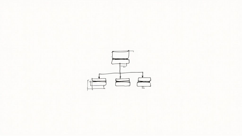
A hierarchical structure is characterized by clear parent-child relationships between pages, with logical grouping of related content. For instance, an e-commerce website might have "Clothing" as a parent category, with "Men's Clothing" and "Women's Clothing" as child categories. Further down, "Men's Clothing" could have subcategories like "Shirts," "Pants," and "Jackets." To aid navigation within deeper levels, breadcrumb trails are essential. These visually represent the user’s path through the site, allowing them to easily backtrack or understand their current location. A well-implemented hierarchy also typically limits depth to a maximum of three levels to avoid overwhelming users. Learn more about Intuitive Hierarchical Structure and delve deeper into the principles of effective website organization.
Implementing a hierarchical structure offers several benefits. It significantly improves information findability, enabling users to quickly locate what they need. By providing a clear and predictable path, it reduces cognitive load, making the browsing experience less mentally taxing. This structure also scales well for content-rich websites, allowing for the organized expansion of content without compromising navigability. Furthermore, it supports SEO efforts by presenting search engines with a logical content organization, contributing to better indexing and ranking.
However, hierarchical structures can become complex and unwieldy if they become too deep, potentially burying valuable content. Planning a comprehensive hierarchy for a large website can be a significant undertaking. Another potential drawback is the limitation it can impose on cross-categorical content, where information might logically belong under multiple parent categories.
Several successful websites demonstrate the effectiveness of hierarchical navigation. Apple.com uses clear product categories with logical sub-categories, allowing users to easily browse their offerings. Amazon.com employs a department-based hierarchical navigation system with visible subcategories, enabling efficient navigation through their vast product catalog. Wikipedia, a prime example of a content-rich site, organizes millions of articles in a comprehensive and accessible hierarchical structure.
To implement a successful hierarchical structure, conduct card sorting exercises with users to gain insights into how they naturally group information. Strive to limit navigation depth to three levels whenever possible. Use descriptive labels that clearly indicate the content type found within each category and subcategory. Finally, for websites with deeper hierarchies, implementing breadcrumbs is crucial to provide users with context and facilitate easy navigation. By adhering to these best practices, you can create a website navigation experience that is both user-friendly and highly effective.
2. Consistent Navigation Patterns
Consistent navigation patterns are a cornerstone of effective website navigation best practices. This principle emphasizes the importance of predictability and learnability within a website's structure. By maintaining uniformity in navigation elements—including menus, labels, and interactive behaviors—across all pages, you create a seamless and intuitive user experience. This allows visitors to easily orient themselves and find the information they need without unnecessary cognitive strain. This consistency builds trust and confidence, encouraging users to explore more of your site.
How it Works:
Consistent navigation patterns work by establishing a set of predictable cues that users can rely on as they navigate through your website. Think of it like driving on a familiar road – you know where to expect lane markers, traffic signals, and speed limit signs. Similarly, users should be able to anticipate where to find navigation menus, how to interact with them, and what to expect when they click a link.
Features of Consistent Navigation:
- Uniform navigation placement across pages: The main navigation menu should reside in the same location on every page, whether it’s a top horizontal bar, a side vertical menu, or a combination.
- Consistent styling of navigation elements: Font styles, sizes, colors, and spacing should remain consistent for all navigation elements. This includes maintaining a uniform appearance for buttons, links, and drop-down menus.
- Predictable behavior of interactive elements: Hover effects, active states, and transitions should follow the same patterns throughout the website. Users should be able to predict what will happen when they interact with a navigation element.
- Standardized labeling conventions: Use clear and concise labels that accurately reflect the content of each section. Avoid jargon or overly creative terminology that could confuse users.
Pros:
- Reduces learning curve for users: Visitors quickly grasp how to navigate the site, freeing them to focus on the content.
- Builds user confidence and trust: Predictability fosters a sense of reliability and professionalism.
- Decreases cognitive load during site exploration: Users spend less mental energy figuring out how to navigate, leading to a more enjoyable experience.
- Improves overall usability metrics: Reduced bounce rates, increased time on site, and higher conversion rates are often the result of good navigation.
Cons:
- May limit creative design opportunities: Strict adherence to consistency can sometimes feel restrictive for designers.
- Can become monotonous for frequent visitors: While consistency is generally positive, some users might find it repetitive over time. Finding the right balance is key.
- Might not accommodate specialized section needs: Some sections might require unique navigation elements, requiring careful consideration of how to integrate these without disrupting overall consistency.
Examples of Successful Implementation:
- BBC.com: Maintains a consistent global navigation bar across its diverse content sections, allowing users to easily switch between news, sport, weather, and more. (https://www.bbc.com/)
- Airbnb: Preserves navigation patterns across property listings and user flows, creating a seamless experience for booking accommodations. (https://www.airbnb.com/)
- Microsoft.com: Employs consistent navigation patterns across its product pages, enabling users to navigate effortlessly between software, hardware, and services. (https://www.microsoft.com/)
Tips for Implementing Consistent Navigation:
- Create and follow a navigation style guide: Documenting your navigation patterns ensures consistency across the entire website.
- Use the same navigation menu structure on all pages: Avoid changing the order or hierarchy of menu items.
- Maintain consistent positioning of navigation elements: Keep the main navigation in the same location on every page.
- Ensure active states and hover effects follow the same pattern: Provide clear visual cues for users interacting with navigation elements.
- Test navigation consistency across different screen sizes: Ensure your navigation remains consistent and user-friendly on desktops, tablets, and mobile devices.
Popularized By:
- Jakob Nielsen (usability expert)
- Steve Krug (author of 'Don't Make Me Think')
Consistent navigation patterns deserve a prominent place in any list of website navigation best practices because they directly impact user experience. By prioritizing clarity, predictability, and ease of use, you empower your visitors to engage with your content and achieve their goals on your website. This approach is essential for freelance web designers, digital marketing agencies, startup founders, solo entrepreneurs, and UX/UI specialists who strive to create user-centered websites that drive results.
3. Mobile-First Navigation Design
In today's mobile-centric world, ensuring your website offers a seamless experience on smaller screens is paramount for adhering to website navigation best practices. Mobile-first navigation prioritizes designing the navigational structure for smaller screens first and then scaling up to larger desktop versions. This approach, a core tenet of modern web design, ensures your website navigation remains functional, intuitive, and accessible across all devices. It focuses on simplicity and touch-friendly interactions that expand gracefully to larger screens, rather than starting with complex desktop navigation and trying to shrink it down, a process that often leads to a compromised mobile experience.

Mobile-first navigation hinges on several key features that optimize usability on smaller screens. These include space-saving hamburger menus, touch-friendly tap targets (with a minimum size of 44x44 pixels to accommodate fingertip interactions), progressive disclosure of navigation options to avoid overwhelming users, and bottom navigation bars strategically placed for easy thumb access. Learn more about Mobile-First Navigation Design to delve deeper into these crucial elements.
This approach offers significant advantages. It not only ensures usability across all devices, catering to the growing number of mobile users, but it also forces designers to prioritize the most critical navigation elements. By stripping away unnecessary clutter, mobile-first design reduces cognitive load for users, enabling them to find what they need quickly and efficiently. Furthermore, simplifying navigational elements can contribute significantly to improved page load speed. Optimizing your website's speed is crucial for a seamless user experience, especially on mobile devices. A slow-loading site can lead to frustration and lost customers. To enhance your Shopify store's speed and provide a smooth experience for your mobile users, consider exploring various optimization techniques. Resources like Supercharge Your Shopify Store Speed Optimization from ECORN offer practical guidance and can help you optimize page speed.
However, mobile-first navigation isn't without its potential drawbacks. Tucking important navigation options behind menus can sometimes obscure key pathways, limiting the immediate visibility of the site structure. This can lead to additional clicks for users to access certain content.
Several successful examples demonstrate the effectiveness of mobile-first navigation. Twitter leverages a bottom navigation bar for primary functions on its mobile app, placing essential features within thumb's reach. Etsy implements a clean hamburger menu that reveals well-categorized navigation upon interaction. Instagram, another mobile-centric platform, similarly employs a thumb-friendly bottom navigation for core features.
To effectively implement mobile-first navigation, prioritize the most critical navigation paths for immediate access. Utilize bottom navigation for frequently accessed functions on mobile devices, ensuring that all touch targets adhere to the minimum 44x44 pixel guideline. Testing navigation with thumb reach heatmaps can provide valuable insights into user behavior and identify areas for improvement. Consider implementing a sticky header to maintain persistent access to essential navigation elements regardless of scrolling.
Pioneered by Luke Wroblewski, who coined the "Mobile First" approach, and further reinforced by Google's Material Design guidelines, mobile-first navigation has become an essential aspect of website navigation best practices. By embracing this approach, designers can create websites that offer a seamless and user-friendly experience across the diverse landscape of devices used today.
4. Descriptive and Concise Labeling
Descriptive and concise labeling is a cornerstone of effective website navigation best practices. It directly impacts how easily users find the information they need, influencing their overall experience and your website's success. By using clear, concise, and descriptive labels for your navigation links, you empower users to quickly understand where each link leads without having to guess or interpret vague terminology. This clarity is crucial for creating a seamless and user-friendly experience.
This approach prioritizes user-centered terminology over internal jargon, marketing speak, or overly clever wording. Labels should reflect how your target audience thinks about your content and the language they typically use when searching for information. This user-centric focus is key to reducing confusion and ensuring a smooth navigational journey.
Features of Effective Labeling:
- User-centered terminology: Speak your users' language, avoiding internal jargon or technical terms they might not understand.
- Concise wording: Aim for brevity, ideally using 1-3 words per label. Shorter labels are easier to scan and process.
- Consistent naming conventions: Maintain consistency throughout your navigation to avoid confusion. For instance, if you use "Shop" in one section, don't use "Store" in another.
- Scannable vocabulary: Employ simple, recognizable words that users can quickly process while scanning the navigation.
Benefits of Descriptive and Concise Labeling:
- Reduces confusion and hesitation: Clear labels eliminate guesswork and empower users to navigate with confidence.
- Improves navigation efficiency: Users can quickly locate the information they're seeking, reducing the time spent searching.
- Supports users with cognitive disabilities: Clear and simple language makes navigation more accessible for all users.
- Enhances searchability and SEO: Search engines can better understand your site's structure and content with descriptive labels, improving your search rankings.
Examples of Successful Implementation:
- Mailchimp: Uses clear and straightforward labels like "Products," "Resources," and "Inspiration" to categorize its offerings.
- Mayo Clinic: Employs user-focused medical navigation labels, making it easy for patients to find relevant health information.
- REI: Utilizes activity-based labeling that directly matches how outdoor enthusiasts think about gear and activities (e.g., "Camping & Hiking," "Cycling," "Climbing").
Actionable Tips for Implementation:
- Use verbs for action-oriented pages: For pages where users perform an action, employ verbs like "Shop," "Learn," "Contact," or "Download."
- Test labels with user groups: Conduct user testing to ensure your labels are clear and easily understood by your target audience.
- Avoid clever or ambiguous terms: Stay away from vague terms like "Solutions" without further specificity. Instead, opt for concrete and descriptive labels.
- Consider implementing tooltips for complex items: If you must use a slightly more complex label, a tooltip can provide additional context and explanation on hover.
- Use A/B testing to optimize label effectiveness: Experiment with different label variations to see which performs best in terms of click-through rates and user engagement.
Pros and Cons:
Pros: Improved user experience, increased findability, enhanced accessibility, better SEO. Cons: Can be challenging to maintain brevity with complex offerings, may require user testing, might conflict with established brand-specific terminology.
Why This Item Deserves Its Place in the List:
Descriptive and concise labeling is a fundamental aspect of good website navigation best practices. It directly impacts user experience, conversion rates, and overall website effectiveness. By prioritizing clarity and user-centered language, you create a more intuitive and enjoyable browsing experience for everyone. This practice, popularized by organizations like the Information Architecture Institute and usability experts like Jared Spool, represents a critical step towards building a user-friendly and successful website.
5. Visual Hierarchy and Emphasis
Visual hierarchy and emphasis are crucial for effective website navigation best practices. This principle leverages design elements like size, color, spacing, and positioning to guide users' attention to the most important navigation options. By creating a clear visual hierarchy, you enable users to quickly distinguish between primary, secondary, and tertiary navigation paths based on their visual prominence within the overall website navigation. This not only improves user experience but also helps drive conversions by strategically highlighting key actions or areas.

This approach works by using visual cues to communicate the relative importance of different navigation elements. Larger, bolder, or more brightly colored items naturally draw the eye first, indicating primary navigation options. Subtle changes in size, color saturation, or spacing then delineate secondary and tertiary levels, creating a clear path for the user's eye to follow. Features like size differentiation between primary and secondary navigation, strategic use of color and contrast, thoughtful spacing and grouping of related items, and clear visual indicators for active states and the current location all contribute to a robust and intuitive visual hierarchy.
Successful implementations of visual hierarchy can be seen across the web. Shopify, for example, uses prominent call-to-action (CTA) buttons alongside its standard navigation to draw attention to key conversion points. Slack employs color and size to differentiate workspace navigation from individual feature menus. Dropbox utilizes a more subtle visual hierarchy to distinguish between its various product sections. These examples demonstrate how visual hierarchy can be adapted to suit different website styles and user needs while still adhering to website navigation best practices.
Tips for Implementing Visual Hierarchy:
- Apply the 60-30-10 rule: Distribute visual weight across your navigation elements using this classic design principle. Allocate 60% to primary navigation, 30% to secondary, and 10% to tertiary.
- Use bold formatting: Emphasize primary navigation items with bold font weights to make them stand out.
- Ensure color contrasts meet WCAG accessibility standards: Prioritize accessibility by ensuring sufficient contrast between text and background colors, particularly for users with visual impairments.
- Use whitespace strategically: Group related navigation items together and separate them from other elements with whitespace to improve readability and scannability.
- Implement hover states that reinforce hierarchy: Use hover effects (changes in color, size, or background) to further highlight interactive elements and provide visual feedback to the user.
Pros:
- Guides users to the most important actions and areas of your website.
- Reduces search time for common destinations.
- Helps users understand the site's structure and the relative importance of different sections.
- Supports both first-time and returning visitors.
Cons:
- Can be challenging to implement responsively across different screen sizes.
- Risks overemphasis on marketing priorities over genuine user needs if not carefully considered.
- May require careful accessibility considerations, especially when relying heavily on color to convey hierarchy.
Visual hierarchy and emphasis deserve a prominent place in any discussion of website navigation best practices because they directly address the core challenge of guiding users efficiently through a website. By prioritizing the most important elements and creating a clear visual flow, you empower users to find what they need quickly and easily, leading to a more positive and productive user experience. This, in turn, contributes to improved engagement, conversion rates, and overall website success for freelance web designers, digital marketing agencies, startup founders, solo entrepreneurs, and UX/UI specialists alike. The principles popularized by Dieter Rams and Don Norman underscore the enduring importance of clear and intuitive design in creating effective user interfaces.
6. Search Functionality Integration
Effective website navigation is crucial for a positive user experience. Alongside traditional menu-based navigation, integrating robust search functionality is a key best practice for modern websites. This dual-navigation approach caters to diverse user preferences and behaviors, making content discovery more efficient and enjoyable. Search functionality integration deserves its place on this list because it empowers users, particularly those who know precisely what they're looking for, to bypass traditional browsing and directly access the desired content. This is especially vital for websites with extensive content libraries or complex product catalogs.
How it Works:
Search functionality operates by indexing your website's content and allowing users to query this index using keywords or phrases. A well-implemented search feature provides relevant results quickly and accurately, guiding users to the specific information or product they seek. This complements traditional navigation by offering an alternative, often faster, route to content discovery.
Features of Effective Search Integration:
- Prominent Search Bar Placement: The search bar should be easily visible, typically located in the header or top-right corner of the page (for Western audiences). This ensures quick access for users.
- Autocomplete and Predictive Search Suggestions: As users type, the search bar should offer suggestions based on popular queries or matching content. This feature speeds up the search process and helps users refine their search terms.
- Filters and Advanced Search Options: For complex websites or e-commerce platforms, filters and advanced search options allow users to narrow down their search results by specific criteria (e.g., price range, category, date).
- Categorized Search Results: Presenting search results grouped by relevant categories enhances clarity and helps users navigate the results page more efficiently.
Pros:
- Accommodates Search-Oriented Users: Caters to users who prefer direct searching over browsing through menus.
- Direct Path to Specific Content: Provides a faster route to specific information or products.
- Valuable for Content-Rich Sites: Particularly beneficial for websites with extensive content libraries, e-commerce sites, or knowledge bases.
- Reduces Navigation Fatigue: Simplifies content discovery for returning users who are familiar with the site's content.
Cons:
- Maintenance of Search Algorithms: Requires ongoing maintenance and optimization of search algorithms to ensure accuracy and relevance.
- Resource Intensive: Implementing effective search functionality can be resource-intensive, requiring dedicated server resources and development effort.
- Potential for User Frustration: Poorly implemented search functionality, with inaccurate or irrelevant results, can lead to user frustration and negatively impact the user experience.
Examples of Successful Implementation:
- Netflix: Seamlessly combines category-based navigation with a powerful search engine, enabling users to find specific movies and TV shows by title, actor, genre, or keyword.
- Home Depot: Features a prominent search bar with category suggestions, helping users quickly find specific products within their vast catalog.
- GitHub: Integrates a global search function with repository-specific filtering, allowing developers to find code repositories, users, and issues efficiently.
Actionable Tips for Implementation:
- Strategic Placement: Position the search bar in the top-right corner (for Western audiences) or adhere to established platform conventions.
- Type-ahead Suggestions: Implement type-ahead suggestions based on popular searches and trending topics.
- Zero-Results Handling: Provide helpful suggestions and alternative search terms when no results are found.
- Voice Search Integration (Mobile): Consider integrating voice search for mobile users to enhance accessibility and convenience.
- Search Analytics: Analyze search queries to gain insights into user behavior and identify areas for improving both search functionality and overall website navigation.
Popularized By:
- Google: Set the standard for search functionality, influencing user expectations for quick and accurate search results.
- Amazon: Pioneered the integration of robust search within e-commerce platforms, shaping how users shop online.
By thoughtfully integrating robust search functionality, you can significantly enhance website navigation, cater to diverse user preferences, and create a more user-friendly and efficient online experience. This contributes to increased user engagement, improved conversion rates, and ultimately, a more successful website.
7. Contextual Navigation
Contextual navigation is a powerful tool in website navigation best practices, enhancing user experience by providing relevant options based on their current location within your site. Think of it as a guide that anticipates user needs and offers helpful suggestions based on the context of the page they are viewing. This approach moves beyond the static structure of main navigation and creates more dynamic and personalized user journeys. This is crucial for freelance web designers, digital marketing agencies, startup founders, solo entrepreneurs, and UX/UI specialists looking to improve their website's performance.
How it Works:
Contextual navigation complements your main navigation by offering links and suggestions directly related to the content being viewed. This might include:
- Related content suggestions: Articles, products, or pages related to the current item.
- Topic-specific sub-navigation: A secondary navigation menu appearing only within a specific section of the website.
- Contextual calls-to-action: Encouraging users to take the next logical step, like "Add to Cart" on a product page or "Sign Up for Our Newsletter" on a blog post.
- Progressive disclosure of relevant options: Revealing additional navigation choices as the user interacts with the page, preventing information overload.
Examples of Successful Implementation:
- Wikipedia: Masterfully uses contextual links within articles, allowing users to delve deeper into related topics without losing their place. This fosters exploration and enhances understanding of complex subjects.
- The New York Times: Presents related articles and topic pages alongside news stories, encouraging users to explore different facets of a story or related current events.
- Spotify: Offers contextual music recommendations based on listening history and current playback, creating a personalized and engaging experience.
Why Use Contextual Navigation?
Contextual navigation deserves its place among website navigation best practices because it directly addresses user needs and encourages deeper engagement. It supports exploration, content discovery, and intuitive user journeys.
Benefits:
- Increases page view depth and engagement: By offering relevant content readily available, users are more likely to explore further.
- Reduces dependency on main navigation for exploration: Users can navigate within a specific section or topic without constantly returning to the main menu.
- Supports discovery of relevant content: Users are exposed to content they might not have found through the main navigation alone.
- Creates more intuitive user journeys: The website anticipates user needs and provides relevant options at each stage of their visit.
Pros and Cons:
Pros: (as listed above)
Cons:
- Can create inconsistency if poorly implemented: Contextual navigation should be carefully designed and integrated to avoid confusing users.
- May distract from primary content if overused: Too many suggestions can overwhelm users and detract from the main message.
- Requires thoughtful content relationships and metadata: Implementing effective contextual navigation relies on accurate tagging and categorization of content.
Actionable Tips for Implementation:
- Analyze user flows: Identify natural next steps users might take on different pages.
- Visually distinguish contextual navigation from main navigation: Use distinct styling to avoid confusion.
- Implement robust content tagging and relationships: Ensure accurate and consistent tagging to enable effective contextual suggestions.
- Use behavior data to refine contextual suggestions: Track user interactions to understand what resonates and refine your approach over time.
- Consider implementing 'breadbox navigation': Show related categories to provide context and orientation within the website.
Popularized By:
Amazon's "Customers who bought this also bought" feature pioneered product-based contextual recommendations. The Nielsen Norman Group has conducted extensive research on the effectiveness of contextual navigation in improving user experience.
By implementing contextual navigation thoughtfully, you can significantly enhance the usability and effectiveness of your website, creating a more engaging and rewarding experience for your target audience. This is a vital strategy for anyone involved in web design, marketing, or running an online business.
8. Progressive Disclosure Navigation
Progressive disclosure navigation is a crucial element of website navigation best practices, particularly for complex websites or applications. It's a strategy that improves user experience by revealing information gradually, reducing cognitive overload and streamlining the user journey. Instead of bombarding users with a plethora of choices upfront, progressive disclosure presents only the most relevant options initially, unveiling further options as the user interacts with the interface. This approach simplifies decision-making and allows users to focus on the task at hand, contributing to a more intuitive and efficient navigation experience. This is why it deserves a place amongst the best practices for website navigation.
How It Works
Progressive disclosure navigation operates on the principle of "need-to-know." It strategically hides secondary or less frequently accessed options behind expandable menus, accordions, or other interactive elements. These hidden options are then revealed upon user interaction, such as hovering over a menu item, clicking a button, or progressing through a step-by-step process. This layered approach allows users to discover deeper levels of information only when they actively seek them.
Features of Progressive Disclosure Navigation:
- Expandable menus and accordions: These are classic examples, allowing users to expand and collapse sections to reveal or hide content.
- Hover or click-to-reveal submenus: These provide immediate access to sub-navigation items upon interaction, without requiring a page reload.
- Step-by-step guided navigation: This approach guides users through a sequence of choices, revealing the next set of options only after the previous step is completed.
- Context-sensitive option presentation: This dynamically presents options based on the user's current context or previous actions.
Pros:
- Reduces visual clutter and cognitive overload: By presenting only essential information upfront, it simplifies the interface and makes it easier to scan and comprehend.
- Simplifies initial user experience: New users aren't overwhelmed with a complex navigation structure, leading to a smoother onboarding experience.
- Works well for complex sites with many options: It effectively organizes large amounts of content, making it easier for users to find what they're looking for.
- Adapts naturally to mobile interfaces: The limited screen real estate on mobile devices makes progressive disclosure an ideal solution for maintaining a clean and usable interface.
Cons:
- Can increase interaction cost (more clicks required): Accessing deeper levels of information may require multiple clicks or interactions.
- May hide important options too deeply: If not implemented carefully, crucial options might be buried too deep within the navigation hierarchy.
- Requires careful usability testing to balance disclosure levels: Finding the right balance between visible and hidden options is critical for optimal usability.
Examples of Successful Implementation:
- LinkedIn: Employs progressive disclosure within its dashboard navigation, revealing different sections and functionalities as users explore.
- Adobe Creative Cloud: Progressively reveals tool-specific options and settings based on the user's current task.
- Salesforce: Utilizes progressive disclosure extensively to manage its complex enterprise navigation, presenting users with relevant options based on their roles and permissions.
Tips for Implementing Progressive Disclosure Navigation:
- Prioritize options based on frequency of use and importance: Place frequently accessed options at the top level of the navigation and less frequent options deeper within the hierarchy.
- Ensure transitions between disclosure levels are smooth and predictable: Use clear animations and visual cues to indicate expanding and collapsing sections.
- Use animation thoughtfully to indicate expanding/collapsing: Subtle animations can enhance the user experience and provide visual feedback.
- Test with users to find the right balance of visible vs. hidden options: Usability testing is essential for optimizing the navigation structure and ensuring that users can easily find what they need.
- Provide visual cues for additional content (e.g., chevrons, plus icons): Visual cues help users understand that there are more options available.
Popularized By:
The concept of progressive disclosure has been championed by prominent figures in the field of user experience, including Jakob Nielsen (usability expert) and Alan Cooper (interaction design pioneer). Their work highlights the importance of simplifying interfaces and reducing cognitive load for optimal usability.
9. Accessibility-First Navigation
Accessibility-first navigation is a crucial element of website navigation best practices. It focuses on ensuring that all users, including those with disabilities, can perceive, understand, navigate, and interact with a website's content effectively. This approach prioritizes building navigation systems that work seamlessly for everyone, regardless of whether they use assistive technologies like screen readers, keyboard navigation, voice control, or have cognitive, visual, or motor limitations.
This approach doesn't just benefit users with disabilities; it often improves the browsing experience for all users. A well-structured, accessible website is generally easier to understand and navigate, regardless of how a user accesses it. Furthermore, adopting accessibility-first navigation demonstrates a commitment to inclusive design, fostering a positive brand image and widening your potential audience.
Key Features of Accessibility-First Navigation:
- Keyboard Navigability: Ensuring all interactive elements are reachable and usable using the Tab key. This includes a logical tab order and clear visual focus indicators.
- ARIA Landmarks and Labels: Utilizing ARIA (Accessible Rich Internet Applications) attributes to provide semantic information to assistive technologies, defining page regions and labeling interactive elements.
- Sufficient Color Contrast: Maintaining adequate contrast between text and background colors to ensure readability for users with low vision.
- Screen Reader Compatibility: Designing navigation that can be interpreted and conveyed effectively by screen readers.
- Support for Text Resizing: Ensuring the layout doesn't break when users increase text size in their browser settings.
Pros:
- Enhanced User Experience for All: While primarily benefiting users with disabilities, accessible navigation often improves usability for everyone.
- Legal Compliance: Meets accessibility requirements mandated by legislation like the Americans with Disabilities Act (ADA) in many jurisdictions.
- Inclusive Design Principles: Demonstrates a commitment to inclusivity and ethical design practices.
- Improved SEO: Semantic HTML used in accessible navigation can also boost SEO.
Cons:
- Development Effort: Implementing accessibility features can require additional development time and resources.
- Design Constraints: Accessibility considerations might constrain certain visual design choices.
- Ongoing Testing: Thorough testing with various assistive technologies is necessary to ensure true accessibility.
Examples of Successful Implementation:
- Gov.uk: Provides an exemplary accessibility-first navigation approach.
- WebAIM.org (Web Accessibility In Mind): Demonstrates numerous accessible navigation best practices.
- Microsoft.com: Implements comprehensive keyboard navigation throughout its website.
Actionable Tips for Implementation:
- Implement Skip Navigation Links: Allow keyboard users to bypass repetitive navigation sections.
- Ensure Keyboard Accessibility: Every interactive element should be operable using the keyboard alone.
- Use ARIA Roles and Labels: Provide context and meaning to navigation elements for assistive technologies.
- Test with Assistive Technologies: Regularly test navigation using screen readers and keyboard-only navigation to identify and fix any issues.
- Maintain Focus Visibility: Clearly indicate which element currently has keyboard focus.
- Provide Multiple Ways to Navigate (WCAG 2.4.5): Offer users different ways to find content, such as sitemaps and search functionality.
When and Why to Use This Approach:
Accessibility-first navigation should be a foundational element of every website. It's not an optional feature but a core principle of good web design. By prioritizing accessibility from the outset, you build a more inclusive and user-friendly website for everyone. Learn more about Accessibility-First Navigation.
For freelance web designers, digital marketing agencies, startup founders, solo entrepreneurs, and UX/UI specialists, embracing accessibility-first navigation is not just ethically sound but also strategically advantageous. It expands your target audience, mitigates legal risks, and contributes to a more positive brand image. It's a key aspect of delivering high-quality, user-centered web experiences. Popularized by organizations like the W3C Web Accessibility Initiative (WAI), WebAIM (Web Accessibility In Mind), and the WCAG (Web Content Accessibility Guidelines), accessibility-first navigation is an essential best practice for modern web development.
10. Data-Driven Navigation Optimization
Data-driven navigation optimization is a crucial aspect of website navigation best practices. It elevates navigation design from guesswork to a scientific process, ensuring your website's structure truly serves your users. This approach uses website analytics, user testing, and behavior tracking to continuously refine navigation structures. Instead of relying on assumptions about user behavior, data-driven optimization treats navigation as an evolving system that improves based on real user interactions. This leads to a more intuitive and effective navigation experience aligned with actual usage patterns. This deserves a place in this list because it ensures your website navigation isn't static but constantly adapts to best serve your users, resulting in improved engagement and conversion rates.
How it Works:
Data-driven navigation optimization involves collecting and analyzing various types of data to understand how users interact with your website's navigation. This data informs decisions about how to structure, label, and organize navigation elements to improve usability and achieve business goals. It’s a continuous cycle of data gathering, analysis, implementation, and further testing.
Features and Benefits:
Several key features enable this data-driven approach:
- Heat mapping of navigation interactions: Visual representations show where users click most frequently on your navigation, revealing popular sections and potential usability issues.
- A/B testing of navigation structures: Comparing different navigation variations allows you to identify which performs best in terms of user engagement and conversions.
- User flow analysis: Tracking how users navigate through your website helps identify bottlenecks and areas for improvement in the user journey.
- Search query analysis: Analyzing what users search for on your website can reveal gaps in your navigation and suggest new categories or labels.
- Conversion funnel tracking: Monitoring user progress through the conversion funnel helps identify drop-off points related to navigation difficulties.
These features provide tangible benefits, including:
- Creates navigation based on actual user behavior: No more guessing! Design decisions are based on real user data.
- Identifies and resolves navigation pain points: Data reveals where users struggle to find information, allowing you to address these issues directly.
- Improves conversion rates and engagement metrics: A more intuitive navigation leads to better user engagement and higher conversion rates.
- Provides objective basis for navigation decisions: Data provides concrete evidence to support navigation changes, facilitating stakeholder buy-in.
Examples of Successful Implementation:
Several industry giants demonstrate the power of data-driven navigation optimization:
- Netflix: Constantly analyzes viewing patterns to optimize navigation and content recommendations.
- Booking.com: Employs extensive A/B testing to refine navigation and maximize booking conversions.
- Amazon: Continuously evolves its navigation based on shopping behavior data to improve product discoverability.
Actionable Tips:
Here’s how you can implement data-driven navigation optimization on your website:
- Implement click tracking on all navigation elements: Capture data on which navigation links are clicked most and least often.
- Set up regular A/B tests for navigation changes: Test different versions of your navigation to determine which performs best.
- Analyze search terms to identify missing navigation items: If users frequently search for something not readily available in your navigation, consider adding it.
- Review navigation bounce rates to identify problem areas: High bounce rates from certain navigation entries may indicate usability issues.
- Combine quantitative data with qualitative user feedback: Gather user feedback through surveys and usability testing to complement your quantitative data.
- Create a regular cadence for navigation review and optimization: Don't just set it and forget it! Regularly review and refine your navigation based on ongoing data analysis.
Pros and Cons:
While incredibly valuable, data-driven optimization isn't without its challenges:
Pros: Objective decision-making, improved user experience, increased conversions.
Cons: Requires analytics infrastructure, potential for inconsistency with frequent changes, needs careful data interpretation.
Popularized By:
Tools like Google Analytics, Optimizely (and other A/B testing platforms), and the research of the Nielsen Norman Group have been instrumental in popularizing and advancing the field of data-driven navigation optimization.
When and Why to Use This Approach:
Data-driven navigation optimization is particularly valuable for websites with high traffic volumes, complex navigation structures, or a strong focus on conversions. If you’re serious about creating a user-centered website that performs well, this approach is essential. For freelance web designers, agencies, and startups, this approach can differentiate their work and demonstrate a commitment to creating truly effective websites. For UX/UI specialists, it provides the necessary data to justify design decisions and ensure a user-friendly experience.
10-Point Website Navigation Best Practices Comparison
| Practice | 🔄 Complexity | ⚡ Resources | 📊 Outcomes | ⭐ Advantages |
|---|---|---|---|---|
| Intuitive Hierarchical Structure | Moderate planning required | Moderate design and planning investment | Enhanced clarity and SEO-friendly content grouping | Improved findability and reduced cognitive load |
| Consistent Navigation Patterns | Low – set once and reused | Minimal – relies on style guides and uniform design | Predictable user experience and smoother navigation flow | Simplifies usability and lowers learning curve |
| Mobile-First Navigation Design | Moderate – focus on small screen adaptation | Moderate – involves responsive design and mobile testing | Better mobile usability and faster page load times | Optimized for touch interactions and prioritization |
| Descriptive and Concise Labeling | Low – mainly focused on clear wording | Minimal – content review and iterative testing | Increased clarity and efficient user navigation | Clear communication and improved SEO |
| Visual Hierarchy and Emphasis | Moderate – requires design adjustments and testing | Moderate – demands design expertise and usability evaluation | Directed user attention to key actions and content areas | Strong emphasis on important elements through design |
| Search Functionality Integration | High – robust backend search development | High – extensive integration and ongoing maintenance | Direct access to content and reduced navigation fatigue | Provides an alternate discovery pathway |
| Contextual Navigation | Moderate – context-sensitive design implementation | Moderate – needs data analysis and effective content tagging | Increased engagement through personalized navigation cues | Creates intuitive user journeys with relevance |
| Progressive Disclosure Navigation | Moderate – involves interactive design elements | Moderate – requires usability testing to balance options | Reduced visual clutter with simplified initial presentation | Balances information density with a clear flow |
| Accessibility-First Navigation | High – must meet strict accessibility standards | High – extra development and testing across assistive tools | Inclusive access for all users and enhanced usability | Ensures legal compliance and universal user support |
| Data-Driven Navigation Optimization | High – continuous iterative changes based on data | High – needs robust analytics and testing infrastructure | Navigation refined to align with real user behavior | Delivers objective insights and improved conversion |
Ready to Elevate Your Website Navigation?
Mastering website navigation best practices is crucial for online success. From establishing an intuitive hierarchical structure and ensuring consistent navigation patterns to prioritizing mobile-first design and incorporating robust search functionality, every element plays a vital role in shaping user experience. Remember that clear, concise labeling, effective visual hierarchy, and accessibility considerations are paramount. Leveraging techniques like contextual navigation and progressive disclosure can further enhance user engagement while data-driven optimization allows you to continually refine your approach based on user behavior. By implementing these website navigation best practices, you'll create a website that is not only easy to use but also effectively guides visitors toward desired actions, ultimately boosting conversions and achieving your business goals.
Applying these principles transforms a simple website into a powerful tool for engagement and conversion. By focusing on user needs and employing these best practices, you create a seamless and enjoyable browsing experience that encourages visitors to explore, engage, and ultimately convert.
Want to streamline your website navigation audit and pinpoint areas for improvement? Roast My Web offers comprehensive website analysis, including navigation audits, generating client-ready reports to help you implement these best practices efficiently. Start optimizing your website's navigation today and unlock its full potential!