Level Up Your Web Experience
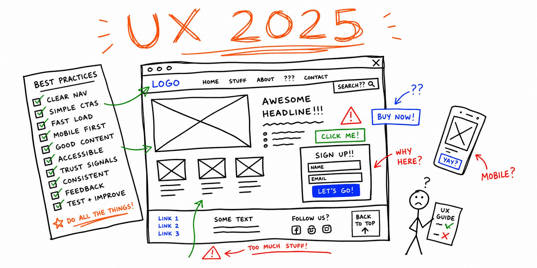
In 2025, user experience (UX) is the most important factor for the success of your website. A poorly designed website can cripple even the most innovative business. Those clunky, information-overloaded websites of the early internet era serve as a reminder of how crucial user-centered design truly is. From the advent of the graphical user interface (GUI) to the mobile-first approach, the focus has shifted towards seamless and enjoyable online experiences. Prioritizing the user’s perspective, once a novel idea, is now the cornerstone of a successful online presence.
Effective UX isn’t about chasing trends; it’s about applying psychological principles and design thinking to create intuitive and engaging digital experiences. It’s about understanding how users interact with your website, their goals, and removing any obstacles hindering conversion. Understanding and effectively managing the development process is crucial for ensuring a user-centered website that meets both business objectives and user needs. Whether it’s optimizing page load speeds or implementing accessible design principles for inclusivity, every element contributes to the overall user journey. Need a checklist? Use the website UX checklist and the website usability checklist.
This article presents 10 essential UX best practices for anyone involved in creating and maintaining websites, from freelance web designers and digital marketing agencies to startup founders and UX/UI specialists. Implementing these strategies can transform your website from a simple storefront into a powerful engine for engagement, conversion, and ultimately, success. Discover how to create a website that not only attracts visitors but keeps them returning by using strategies that keep visitors engaged.
1. Intuitive Navigation Design
Intuitive navigation is the cornerstone of a positive user experience (UX). Think of it as the digital equivalent of a well-organized library. If users can't find what they need quickly and easily, they'll simply leave. For website owners, this translates to higher bounce rates, lower conversion rates, and ultimately, lost business. This is why intuitive navigation is paramount. It directly impacts a user's ability to find information and complete tasks efficiently, ultimately determining a website's success. A well-organized site's structure, including effective information architecture and internal linking, supports intuitive navigation and enhances both user experience and SEO.

Intuitive navigation involves creating clear, consistent, and logical navigation patterns that feel natural, regardless of the page or device. Several key features contribute to this, and using a user journey mapping template can help identify and optimize these elements:
- Clear Navigation Hierarchy: Organizing information logically, from broad categories to specific sub-pages.
- Consistent Menu Placement: Keeping the navigation structure and location the same across all pages. This allows users to always know where to find what they need.
- Breadcrumb Trails for Complex Sites: These visual cues show users their current location within the site hierarchy, especially helpful for large, multi-level websites.
- Hamburger Menus for Mobile: Condensing navigation options into a compact menu on mobile devices, maximizing valuable screen space.
- Visual Cues to Indicate Current Location: Highlighting the user's current page within the navigation menu helps provide context and orientation.
Benefits of Intuitive Navigation
A well-designed navigation system offers numerous advantages:
- Reduces user frustration and abandonment: When users can easily find information, they're more likely to stay engaged.
- Decreases learning curve for new visitors: A clear structure makes it easy for first-time visitors to understand the site's organization.
- Improves overall site efficiency and engagement: Intuitive navigation streamlines the user journey, leading to greater engagement.
- Supports better information architecture: Well-designed navigation reflects a well-structured information architecture, simplifying content management and updates.
Potential Drawbacks
While the benefits are clear, some challenges can arise:
- Can be challenging to implement for content-heavy sites: Websites with extensive content might require more complex navigation solutions.
- May require significant user testing to perfect: Different user groups may have varying preferences. Thorough testing ensures optimal usability.
- Understanding Target Audience Behavior is Critical: Different user groups navigate differently. Understanding your target audience is crucial for designing effective navigation.
Real-World Examples
Several well-known websites exemplify effective navigation:
- Apple.com: Known for its minimalist top navigation, focusing on key product categories with easy access to support and shopping.
- Amazon.com: Employs a mega menu, allowing users to browse a vast product catalog organized by department and sub-category.
- Airbnb.com: Utilizes context-aware navigation that adapts to the user's stage in the booking process.
Tips for Implementation
Consider these practical tips when designing your website's navigation:
- Limit main navigation items to 7±2 (Miller's Law): Avoid overwhelming users with excessive choices.
- Use descriptive labels: Clarity is paramount. Use labels that clearly communicate the content of each section.
- Implement a 'three-click rule' (a guideline, not a hard rule): Aim for users finding information within three clicks, but prioritize user testing.
- Test navigation with real users across different devices: Gather feedback and iterate based on real-world usage patterns.
- Ensure navigation is keyboard accessible: Cater to users who navigate with keyboards.
Evolution and Popularization
Usability experts like Jakob Nielsen have long championed the importance of intuitive navigation. His research and heuristics have significantly shaped modern UX design. Steve Krug, author of "Don't Make Me Think," further emphasized effortless navigation, advocating for self-explanatory designs. Their work has contributed to the widespread adoption of user-centered design principles, placing intuitive navigation at the forefront of website development best practices.
2. Responsive Design Implementation
In today's world, people access websites from various devices, from smartphones and tablets to laptops and desktops. Responsive design is essential. It ensures your website functions correctly and looks good on all platforms. Responsive design dynamically adjusts the layout, image sizes, and interactive elements based on the user's screen size, ensuring all web pages and website pages are optimized for every device. This creates a seamless and consistent user experience, no matter how your audience accesses your site.
The rise in mobile browsing makes responsive design even more critical. A positive mobile experience directly impacts user engagement, conversion rates, and your website's success. Using established design patterns and visual elements such as high-quality images, typography, and color schemes in your layout helps create a cohesive experience. It's a core element of website UX best practices.
Key Features of Responsive Design
- Fluid Grid Layouts: Content is structured using relative units like percentages instead of fixed pixels. This allows it to adapt to different screen widths.
- Flexible Images and Media: Images and videos automatically resize to fit their containers, preventing overflow or cropping issues.
- CSS Media Queries: These rules let developers apply different styles based on screen size, resolution, orientation, and other device characteristics. CSS is the language we use to style an HTML document.
- Touch-Friendly Interface Elements: Buttons and interactive elements are designed with larger touch targets optimized for touch interactions.
- Device-Appropriate Content Prioritization: Content is prioritized and structured according to the device, making sure important information is readily available.
Pros of Responsive Design
- Reduced Maintenance Costs: One codebase serves all devices, streamlining development and reducing maintenance.
- Improved SEO: Search engines, especially Google, prioritize mobile-friendly websites, improving your search ranking.
- Consistent User Experience: A uniform experience across platforms strengthens brand identity.
- Future-Proof Design: Adapts to new devices and screen sizes, minimizing constant redesigns.
Cons of Responsive Design
- Complexity for Highly Interactive Sites: Implementing responsive design for websites with complex interactions and animations can be difficult.
- Mobile Performance Optimization: Careful optimization for mobile data constraints is necessary for fast loading times. Monitoring site performance and minimizing website loading times across all devices is essential to ensure optimal user experience and search engine ranking.
- Device-Specific Solutions: Some advanced features might need device-specific coding.
Real-World Examples of Responsive Design
- The Boston Globe (www.bostonglobe.com): An early adopter of responsive design, showing its effectiveness in delivering news across platforms.
- Shopify (shopify.com): Shopify’s platform lets businesses create online stores with automatically responsive storefronts, ensuring a seamless shopping experience.
- Smashing Magazine (www.smashingmagazine.com): This web design and development resource uses responsive design through fluid typography and adaptive layout.
Practical Implementation Tips
- Mobile-First Approach: Design for the smallest screen first, then enhance for larger screens. This ensures core content is mobile-optimized.
- Relative Units: Use percentages, ems, and rems for element sizing for proportional scaling.
- Real Device Testing: Test on actual devices to find and fix device-specific problems. Browser emulators are helpful, but not perfect.
- Image Optimization: Use the
srcsetattribute to serve different image resolutions, improving loading times. - Feature Detection: Prioritize checking if a browser supports a feature over identifying the specific device. This provides greater flexibility.
History and Popularization
Ethan Marcotte coined the term "responsive web design" in 2010. Luke Wroblewski advanced the concept with his mobile-first approach. Twitter's release of the Bootstrap framework further popularized responsive design by giving developers tools for implementation.
Responsive design is a future-proof solution that improves user experience, SEO, and website maintenance. It's a key part of modern web development and a critical component of online success.
3. Page Load and Website Performance Optimization
In today's fast-paced online world, users expect websites to load quickly. Page load optimization, the process of minimizing a webpage's loading time, is essential for retaining visitors and driving conversions. Users generally expect loading times of under 3 seconds. Slower speeds can lead to frustration and website abandonment, making page load optimization a cornerstone of a positive user experience. Regularly monitoring your site's performance is crucial to ensure consistently fast load times and to maintain high search rankings.
Several key features contribute to effective page load optimization:
- Image Optimization and Compression: Using formats like WebP and AVIF and compressing images reduces file sizes significantly, without major quality loss.
- Minification of CSS and JavaScript: Removing unnecessary characters and whitespace from code files shrinks their size and improves download speeds.
- Caching Strategies: Storing frequently accessed data in a cache allows for quicker retrieval and improves response times.
- Lazy Loading of Off-Screen Content: Loading images and other elements only when they become visible minimizes initial load time.
- Critical Rendering Path Optimization: Prioritizing above-the-fold content ensures users see something quickly, improving perceived performance.
- Server-Side Improvements: Using Content Delivery Networks (CDNs), HTTP/2, and server-side compression can significantly boost page load speed.
Advantages and Disadvantages of Page Load Optimization
Investing in page load optimization offers numerous benefits, but also presents some challenges.
Pros:
- Reduces Bounce Rates: 40% of users abandon websites that take longer than 3 seconds to load.
- Improves Conversion Rates: A 1-second delay can reduce conversions by 7%.
- Enhances User Satisfaction and Engagement: Faster loading creates a smoother user experience.
- Helps with Search Engine Rankings: Search engines prioritize fast-loading websites, improving SEO.
- Reduces Server Costs Through Efficiency: Optimized pages require fewer server resources.
Cons:
- Can Require Technical Expertise: Some optimization techniques require specialized knowledge.
- Ongoing Maintenance: Performance optimization needs adjustments as content changes.
- Visual Richness vs. Performance: Balancing high-quality visuals with optimal load times can be difficult.
Real-World Examples and Implementation Tips
Real-world examples demonstrate the impact of page load optimization. Pinterest reduced perceived wait times by 40% and saw increased traffic and sign-ups. The Financial Times improved user engagement with progressive loading. Airbnb's modular code-splitting reduced their initial bundle size, leading to faster loading. Industry pioneers like Steve Souders, Ilya Grigorik, and Addy Osmani have championed these techniques.
Tips for Implementation:
- Use tools like Google PageSpeed Insights, WebPageTest, and Lighthouse to identify areas for improvement.
- Implement image formats like WebP and AVIF with correct dimensions.
- Adopt a performance budget for each page.
- Use browser hints like preload, prefetch, and preconnect.
- Consider modern approaches like static site generation.
- For a deeper dive into optimization strategies, see this article: How to Improve Website Performance.
Page load optimization is not just a technical detail; it's a fundamental aspect of user experience directly impacting your website's success. Prioritizing performance creates a better experience for users, improves search engine rankings, and helps achieve business goals.
4. Clear Call-to-Action Design
Call-to-actions (CTAs) are crucial elements guiding users toward desired actions on your website. These actions might include signing up for a newsletter, making a purchase, or contacting your team. Effective CTA design is essential for converting visitors into customers and achieving your business objectives. This involves crafting visually appealing buttons and links that integrate seamlessly with the user experience, encouraging interaction without being intrusive. Well-designed CTAs also encourage visitors to take meaningful actions, increasing engagement and participation on your site.
A well-designed CTA is more than just visually appealing; it strategically uses contrast, size, placement, and persuasive language to grab attention and encourage action. Think of high-contrast buttons that stand out against the background, action-oriented text like "Get Started Now" instead of a generic "Submit," and prominent placement within the page layout.
Appropriate size and sufficient white space further enhance visibility. Visual feedback, such as hover effects and click animations, provides users with confirmation and a sense of progress. Mobile optimization is also critical. This means ensuring tap targets are large enough for comfortable interaction on smaller screens, reflecting the importance of mobile browsing.
Benefits of Effective CTAs
Well-implemented CTAs offer several benefits:
- Guide users through intended conversion paths, reducing decision fatigue.
- Clearly indicate the next step in the user journey.
- Streamline the user experience, boosting conversion rates and goal completion.
For example, Netflix uses a prominent "Sign Up Free" button with contrasting red against a dark background, making it instantly noticeable. Slack uses context-specific CTAs that adapt to the user's stage in the journey, offering relevant prompts. Mailchimp uses clear action buttons with supporting microcopy, adding personality while maintaining effectiveness.
Potential Pitfalls of CTA Design
However, CTAs can be misused. Overuse can create visual clutter and overwhelm users, leading to decision paralysis. Aggressive or manipulative CTAs can damage trust and negatively impact the user experience. Furthermore, cultural nuances can influence how CTA styles are perceived, emphasizing the need to understand your target audience.
Implementing Effective CTAs
Creating effective CTAs requires a thoughtful approach:
- Start with a verb: Use action-oriented language like "Start Your Free Trial" or "Download Now."
- Maintain visual hierarchy: Focus on one primary CTA per section.
- A/B test: Experiment with different designs, placements, and copy to optimize for your audience.
- Accessibility: Ensure button sizes meet accessibility guidelines (at least 44x44 pixels on mobile).
- White space: Leverage white space to make CTAs prominent.
- Contextualize: Tailor CTAs to the user's journey stage.
For more in-depth strategies, check out: Our guide on website conversion optimization.
Industry leaders have significantly contributed to best practices in CTA design. Conversion Rate Experts developed numerous CTA testing methodologies. Nielsen Norman Group is known for their usability guidelines for interactive elements. Google's Material Design system has popularized button design standards. By following these principles, you can create CTAs that drive conversions and enhance the overall user experience, making your website a more effective tool for achieving your business goals.
5. Accessible Design Principles
Accessible design isn't just a bonus; it's a core element of good UX. It’s about building websites usable by everyone, regardless of any disabilities they may have. This includes people with visual, motor, auditory, cognitive, and neurological impairments. While meeting legal requirements like the Americans with Disabilities Act (ADA) and Web Content Accessibility Guidelines (WCAG) is critical, accessible design goes further. It improves usability for all users, broadens your audience, and shows social responsibility.
Consider this: 15% of the global population – over 1 billion people – live with some form of disability. By adopting accessible design, you're not only making your website available to a large segment of the population, you're also creating a better experience for everyone. For example, captions on videos help not only deaf users, but also those in loud environments or those who prefer silence. Likewise, clear link text (e.g., "Learn more about our pricing") is better than generic phrases like "click here" for everyone, especially those using screen readers. Additionally, including social media links in accessible locations, such as contact pages or footers, provides users with more ways to connect and engage with your brand.
Key Features of Accessible Design
- Semantic HTML structure: Using HTML elements correctly (e.g.,
<nav>for navigation,<article>for content) improves site structure and accessibility for assistive technologies. - Keyboard navigation support: Ensures users can navigate the entire website using only a keyboard.
- Screen reader compatibility: Makes content understandable to screen reader users.
- Sufficient color contrast (WCAG AA/AAA standards): Ensures enough contrast between foreground and background colors for users with low vision.
- Alternative text for images: Offers text descriptions for images, conveying their meaning to users who can't see them.
- Captions for video content: Makes videos accessible to deaf and hard-of-hearing users.
- Focus indicators: Clearly shows which element currently has keyboard focus.
- Form labels and error handling: Makes forms usable and understandable for everyone, including users with cognitive disabilities.
Pros of Accessible Design
- Wider Reach: Accesses the market of over 1 billion people with disabilities.
- Reduced Legal Risks: Minimizes the chance of lawsuits for accessibility violations.
- Improved SEO: Semantic HTML naturally boosts SEO.
- Enhanced Usability for All: Benefits all users, such as those in low light or with temporary injuries.
- Cleaner Code: Often leads to cleaner, easier-to-maintain code.
Cons of Accessible Design
- Development Time: May require more development time upfront.
- Training: May require training designers and developers in accessibility best practices.
- Maintenance: Requires ongoing maintenance and testing to ensure continued accessibility.
Real-World Examples of Accessible Design
- Gov.uk: A strong example of consistent and accessible government services online.
- The BBC: Provides an accessible media player and website for a broad range of needs.
- Microsoft: Shows a comprehensive approach to accessibility across its products.
Practical Tips for Implementation
- Accessibility Audits: Conduct regular audits using tools like Axe or WAVE.
- Testing: Test with keyboard navigation and screen readers like NVDA or VoiceOver.
- ARIA Attributes: Use ARIA attributes to improve accessibility when standard HTML isn't enough.
- Descriptive Link Text: Use clear, descriptive link text.
- Visible Focus States: Ensure all interactive elements have visible focus states.
- Form Design: Design forms with clear labels and helpful error messages.
- Transcripts: Provide transcripts for audio content.
Evolution and Popularization
The Web Accessibility Initiative (WAI) has played a key role in developing and promoting web accessibility standards. Advocates and experts like Marcy Sutton and Léonie Watson have also been vital in raising awareness and encouraging the use of accessible design practices.
Accessible design is a must-have in any list of UX best practices. It’s essential for building inclusive and user-friendly websites. It's not just about following rules; it's about building a better web for all. By using these principles, you can build a website that is not only legally compliant but also more usable, reaches a wider audience, and shows a commitment to inclusivity.
6. Consistent Visual Hierarchy

Visual hierarchy is fundamental to effective user interface (UI) design. It shapes how users perceive and interact with a website, directly influencing their overall experience. By thoughtfully organizing and prioritizing content, you guide users’ attention, creating a more intuitive and user-friendly interface. This is why consistent visual hierarchy is a cornerstone of UX best practices. Additionally, consistent branding across all pages reinforces a professional and trustworthy image, helping to strengthen brand recognition and support overall brand perception.
Visual hierarchy uses several design elements to establish clear relationships between different content pieces. Let's explore these elements in more detail.
Key Elements of Visual Hierarchy
-
Purposeful Sizing: Larger elements naturally draw the eye, indicating importance. Headings are generally larger than body text, and calls to action are often prominent in size.
-
Strategic Color and Contrast: Color highlights key elements and adds visual appeal. Strong contrast ensures readability and differentiates sections effectively.
-
Typography and Font Weights: Varying font sizes and weights, like using bold text for headings and regular for body text, creates a clear hierarchy within the text itself.
-
Whitespace: Whitespace, also known as negative space, groups related items and separates different sections, improving readability and visual appeal.
-
F-Pattern and Z-Pattern Layouts: These layouts capitalize on natural reading patterns. They place essential information where users are most likely to look – horizontally across the top and then diagonally.
-
Grid Systems: Grid systems) provide a structure for consistent alignment and proportions, creating a balanced and organized layout.
Advantages of a Strong Visual Hierarchy
A well-defined visual hierarchy offers several benefits:
-
Reduced Cognitive Load: Organized information requires less mental effort for users to process. This leads to a more enjoyable and less frustrating experience.
-
Efficient Navigation: Users quickly find what they need, resulting in a smoother user journey and increased engagement.
-
Improved Visual Rhythm and Balance: A well-structured hierarchy creates a visually pleasing and harmonious experience.
-
Supports Diverse Reading Behaviors: Whether users scan content quickly or read in detail, a clear hierarchy caters to both.
Potential Challenges of Visual Hierarchy
While visual hierarchy is crucial, it's essential to be mindful of potential challenges:
-
Cultural Differences: Interpretations of visual hierarchy can vary across cultures. Researching your target audience's preferences is vital.
-
Responsive Design: Maintaining hierarchy across different screen sizes can be complex and requires careful planning.
-
Balancing Marketing and Usability: Prominent marketing elements should not compromise the overall usability of the website.
Real-World Examples of Effective Visual Hierarchy
Many successful websites effectively utilize visual hierarchy:
-
The New York Times (www.nytimes.com): This website demonstrates clear distinctions between headlines, subheadings, and body text, guiding readers effortlessly.
-
Stripe Documentation (stripe.com/docs): Well-structured headings and code examples aid in understanding technical information.
-
Apple Product Pages (www.apple.com): Using progressive disclosure and visual hierarchy, Apple prioritizes key features and benefits.
Practical Tips for Implementing Visual Hierarchy
-
Prioritize Content: Identify the most crucial information and apply visual treatments accordingly.
-
Limit Typographic Hierarchy: Use a maximum of three levels of typographic hierarchy to avoid visual clutter.
-
Test in Grayscale: Ensure your hierarchy is effective even without color.
-
The Squint Test: Squint at your design; the most important elements should still stand out.
-
Consistent Patterns: Maintain consistent hierarchical patterns across similar page types for a unified experience.
-
Micro-interactions: Use subtle animations to reinforce hierarchy during user interactions.
Historical Influences on Visual Hierarchy
The principles of visual hierarchy have been shaped by influential figures like Dieter Rams, known for his ten principles of good design, Josef Müller-Brockmann, a pioneer of grid systems, and Edward Tufte, renowned for his work on information visualization. Their contributions form the basis of modern UX/UI design.
By understanding and implementing consistent visual hierarchy, you significantly improve the user experience, making your website more intuitive, engaging, and effective.
7. Mobile-First Design Approach
In today's world, where mobile devices are increasingly prevalent, prioritizing the mobile user experience isn't just a good idea - it's essential. Mobile-first design is a strategy that addresses this by prioritizing the design and development of the mobile experience before considering desktop versions. This approach inverts the traditional design process, requiring designers and developers to prioritize content and functionality within the constraints of smaller screens. The result is faster, more focused experiences that work seamlessly across all devices, especially important now that mobile traffic often surpasses desktop traffic and most site visitors primarily use mobile devices.
This method begins with the essential elements needed for the smallest screen size and progressively enhances the experience as screen size increases. This guarantees a streamlined, content-focused experience that benefits users on all devices.
Key Features of Mobile-First Design
-
Content Prioritization: Understanding user interaction with content on mobile is crucial. Mobile-first design prioritizes essential content and features for easy access and readability on smaller screens.
-
Performance Optimization: Mobile connections can be unreliable. Mobile-first design emphasizes optimizing website performance for mobile networks, ensuring quick loading times and a smooth browsing experience, even on weaker connections.
-
Touch-Optimized Interface: Buttons, links, and other interactive elements are designed for touch interactions. They are sized and spaced appropriately for easy tapping and swiping.
-
Progressive Enhancement: As screen size increases, extra features and content are gradually introduced, enhancing the experience without affecting core mobile functionality.
-
Streamlined Forms: Forms are simplified and optimized for mobile input, making it easier for users to complete tasks.
-
Offline and Low-Bandwidth Considerations: Mobile-first design considers how the website functions offline or with limited bandwidth, ensuring usability even in challenging conditions.
Pros of Mobile-First
-
Focused, Content-First Experiences: Designing for limited space initially forces prioritization of the most important content and features.
-
Aligns with Google's Mobile-First Indexing: Google primarily uses the mobile version of a website for indexing and ranking. A mobile-first approach ensures your site is optimized for search visibility.
-
Prioritizes Essential Elements: This constraint-led design process often leads to more efficient and user-friendly websites.
-
Faster, More Performant Websites: Leaner designs optimized for mobile inherently perform better across devices.
-
Accommodates Mobile Internet Growth: With the growing dominance of mobile browsing, mobile-first is the future of web design.
Cons of Mobile-First
-
Can Initially Limit Creativity: Starting with mobile constraints can feel restrictive for some designers.
-
Requires Careful Planning of Complex Interactions: Adapting complex functionalities to smaller screens demands careful planning and implementation.
-
Teams May Resist Constraint-First Approach: Shifting to a mobile-first mindset requires a change in workflow and thinking, which some teams might resist.
Real-World Examples
- Facebook: Facebook's mobile web experience offers a streamlined interface focused on core features, expanding and enhancing on desktop.
- Twitter: Twitter's mobile-optimized timeline adapts seamlessly to larger screens, providing consistency across devices.
- The Guardian: The Guardian's news site prioritizes a mobile-first reading experience, ensuring articles are easily accessible and readable on any device.
Practical Tips for Implementing Mobile-First Design
- Start Wireframing at 320px Width: This forces content prioritization within a limited space.
- Design for Touch First (Minimum 44×44px Touch Targets): Ensure interactive elements are easily tappable.
- Consider Cellular Network Constraints: Optimize images and media to minimize loading times.
- Use Feature Detection for Progressive Enhancement: Add features as screen size increases.
- Test on Actual Devices: Real-world testing is crucial to identify and address performance and usability issues.
- Consider Content Hierarchy in Single-Column Layouts: Establish a clear content hierarchy for optimal readability on smaller screens.
You might be interested in: How to Make a Website Mobile-Friendly for more practical advice.
The mobile-first approach was popularized by figures like Luke Wroblewski (author of 'Mobile First'), Ethan Marcotte, and Brad Frost. Their work helped establish mobile-first as a core principle in modern web design. This approach is a key UX best practice as it reflects current internet usage and ensures a positive user experience for most website visitors.
8. User-Centered Content Strategy
In today's competitive online marketplace, a visually appealing website is only part of the equation. What truly engages users and drives conversions is a robust, user-centered content strategy. This approach prioritizes the needs, goals, and context of your target audience, placing them at the heart of content creation. Optimizing landing pages is a key part of this strategy, allowing you to test different variants for better user engagement and conversion rates, and to host progressive lead nurturing forms that adapt to each visitor's journey. Instead of focusing on internal structures or generic marketing messages, user-centered content aims to answer user questions, solve their problems, and guide them seamlessly through their website journey. This is all accomplished while maintaining a consistent brand voice and achieving business objectives.
This approach gained prominence thanks to content strategists like Kristina Halvorson (author of Content Strategy for the Web), Erin Kissane, and Karen McGrane, along with the team at Brain Traffic. They recognized that effective web content isn't just about compelling writing; it's about understanding users and creating content that meets their needs.
Why Is User-Centered Content Strategy Crucial for UX Best Practices?
It bridges the gap between aesthetics and functionality. A visually appealing website lacking helpful, relevant content will quickly lose visitors. User-centered content ensures your website isn't just attractive; it's a valuable resource that keeps users engaged, informed, and motivated.
Key Features of User-Centered Content:
-
Concise, Scannable Text Formatting: Using bullet points, short paragraphs, and clear headings helps users quickly find information.
-
Progressive Disclosure of Complex Information: Presenting information in digestible chunks, with more detail revealed upon interaction (e.g., using accordions or expandable sections), prevents information overload.
-
Audience-Appropriate Language and Reading Level: Tailoring language and complexity to your target audience ensures clarity and understanding. A grade 8-10 reading level is a good starting point for most audiences.
-
Strategic Use of Headings, Lists, and Highlighted Content: These elements guide the user's eye and emphasize key information.
-
Consistent Terminology and Voice: Maintaining a consistent brand voice and using standardized terminology builds trust and reinforces your brand.
-
Purposeful Imagery that Adds Value: Images should complement the content, not just serve as decoration.
Pros of a User-Centered Content Strategy:
-
Increased Engagement and Time on Site: Relevant and helpful content encourages users to explore further.
-
Improved Conversion Rates: Addressing user needs directly increases the likelihood of desired actions.
-
Building Trust and Credibility: Providing valuable information positions you as an authority.
-
Reduced Support Requests: Proactive information anticipates and answers common questions.
-
Improved SEO: Naturally keyword-rich, valuable content can boost search engine rankings.
Cons of a User-Centered Content Strategy:
-
Potential Tension Between Marketing and User Needs: Balancing the two can be challenging.
-
Ongoing Content Maintenance: Keeping content fresh and accurate requires ongoing effort.
-
Resource Intensive: Creating high-quality content requires time, expertise, and resources.
Real-World Examples of User-Centered Content:
-
GOV.UK: The UK government website exemplifies clear language and accessible information.
-
Mailchimp: Their help documentation effectively anticipates and answers user questions.
-
REI: REI's product pages blend technical specifications with practical usage information.
Practical Tips for Implementing a User-Centered Content Strategy:
-
Start with User Research: Understand your audience's questions, needs, and vocabulary.
-
Use the Inverted Pyramid Structure: Present the most important information first.
-
Break Up Text with Subheadings: Use clear and relevant subheadings.
-
Use Active Voice and Direct Address: Engage users directly with clear and concise language.
-
Incorporate Meaningful Visuals: Use images, videos, and infographics to enhance content.
-
Test Content Effectiveness: Measure success based on task completion and user feedback.
By adopting a user-centered content strategy, you can transform your website from a static brochure into a dynamic, engaging platform that effectively serves your users and drives meaningful results.
9. Effective Form Design
Forms are the interactive backbone of many websites. They serve as crucial gateways for user input, from account creation and purchases to feedback submissions and lead generation. Effective form design is critical for a positive user experience, directly impacting conversion rates, data quality, and overall user satisfaction. This involves creating user-friendly interfaces that minimize friction, frustration, and errors. Well-designed forms respect users’ time and effort by incorporating validation, error prevention, helpful feedback, and collecting only necessary information. Incorporating client feedback is essential for refining and improving form design, as it provides valuable insights into user satisfaction and highlights areas for enhancement.
Why is form design so important to UX best practices? Poorly designed forms are a major source of user frustration and abandonment. They can lead to lost sales, inaccurate data, and damage a brand’s reputation. Conversely, well-designed forms streamline user interactions, improve data accuracy, and significantly contribute to business goals.
Features of Effective Forms
-
Clear, Descriptive Labels (Positioned Consistently): Ambiguous labels confuse users. Clear, concise labels placed consistently (typically above the field) provide efficient guidance.
-
Logical Grouping and Sequencing of Fields: Group related fields and arrange them in a logical order that follows the user’s natural thought process.
-
Inline Validation and Error Prevention: Real-time feedback helps users correct errors as they type, preventing later frustration.
-
Smart Defaults and Contextual Help: Pre-filling fields with sensible defaults and providing relevant help text significantly reduces user effort.
-
Responsive Layout: Forms must adapt seamlessly to different screen sizes and devices.
-
Progress Indicators (for Multi-Step Forms): For longer forms, progress indicators give users a sense of accomplishment and encourage completion.
-
Appropriate Input Types: Using specific input types like date pickers, dropdowns, and radio buttons - often implemented with the help of conversion optimization tools - simplifies data entry and improves accuracy.
Pros and Cons of Effective Form Design
Here's a quick look at the advantages and disadvantages:
| Pros | Cons |
|---|---|
| Increased form completion rates | Complex forms may require significant testing and iteration |
| Reduced errors and improved data quality | Different users may have different form preferences |
| Decreased user frustration and abandonment | Balancing brevity with necessary data collection can be challenging |
| Positive impact on conversion rates and business goals | |
| Builds trust through transparency and respect for user effort |
Real-World Examples of Effective Forms
-
Typeform: Known for its conversational approach, Typeform transforms traditional forms into engaging, interactive experiences, boosting user engagement.
-
Gov.uk: The UK government website exemplifies accessibility-focused form design, creating simple, supportive experiences for all users.
-
Stripe: Stripe's payment forms balance stringent security requirements with a smooth, user-friendly checkout process.
Evolution and Popularization of Form Design
The field of form design has evolved significantly, thanks to usability experts like Luke Wroblewski (author of "Web Form Design"), Caroline Jarrett (forms usability expert), and Jessica Enders (founder of Formulate Information Design). Their research and advocacy have brought form design to the forefront of UX best practices, highlighting the importance of user-centered design principles in effective online forms.
Practical Tips for Implementation
-
Only ask for essential information: Every extra field increases the chance of abandonment.
-
Use single-column layouts: These are generally easier to follow, especially on mobile.
-
Place labels above fields: This improves readability and accessibility.
-
Show all fields at once for short forms: Use steps only for longer forms to avoid overwhelming users.
-
Use inline validation: Provide immediate feedback on correct entries.
-
Provide specific, helpful error messages: Guide users towards correcting mistakes.
-
Test forms with actual users on multiple devices: Real-world testing is crucial for identifying and resolving usability issues.
By implementing these best practices, you can create forms that are not only functional but also enjoyable to use, ultimately benefiting both your users and your business.
10. Data-Informed Iterative Design
Data-informed iterative design is a crucial best practice for creating user-centered websites that truly perform. It replaces guesswork and subjective design decisions with a continuous cycle of measurement, experimentation, and improvement based on real user behavior. As part of this iterative process, regularly auditing for broken links and ensuring data security are essential steps to maintain optimal SEO performance and protect user information. This approach uses both qualitative and quantitative data to create websites that not only look good but also achieve their goals.
This methodology recognizes that understanding why users behave in certain ways (qualitative) is just as important as knowing what they are doing on your website (quantitative). Combining these insights allows you to validate design choices, identify areas for improvement, and build experiences that continuously adapt to meet user needs.
Key Features of Data-Informed Iterative Design
- Structured A/B and multivariate testing: Compare different versions of a webpage or element to determine which performs best.
- User session recordings and heatmaps: Visualize user behavior to identify areas of interest or frustration. Tools like Hotjar can provide these insights.
- Conversion funnel analysis: Track user progress through key steps and pinpoint drop-off points.
- Usability testing and user interviews: Gather direct feedback from users about their experience.
- Performance and engagement metrics tracking: Monitor key metrics like bounce rate, time on page, and conversion rates using tools like Google Analytics.
- Systems for collecting and implementing user feedback: Establish channels for users to share their thoughts and suggestions.
Why This Matters
In a competitive online environment, a visually appealing website isn't enough. Data-informed iterative design ensures your website delivers a positive user experience, leading to increased engagement, conversions, and ultimately, business success. This practice bridges the gap between aesthetics and functionality, ensuring your design choices resonate with your target audience and drive desired outcomes.
Pros
- Reduces subjectivity: Decisions are based on evidence, not opinions.
- Continuous improvement: Iterative changes avoid the need for disruptive redesigns.
- Prioritizes high-impact changes: Data highlights areas where improvements will have the biggest effect.
- Builds institutional knowledge: Creates a growing understanding of what works for your audience.
- Connects UX to business metrics: Demonstrates the tangible impact of UX improvements on business goals.
Cons
- Requires infrastructure: Setting up analytics and testing tools takes time and resources.
- Risk of local optimization: Focusing on small improvements can sometimes overshadow bigger opportunities for innovation.
- Potential creative tension: Balancing data-driven decisions with creative vision can be challenging.
- Testing takes time: Achieving statistically significant results requires patience.
Real-World Examples
- Booking.com: Famous for its culture of A/B testing, often running over 1,000 tests simultaneously.
- Google: Rigorously tests even minor UI changes using multivariate testing.
- Etsy: Combines qualitative research with quantitative testing to optimize the user experience for both buyers and sellers.
Practical Tips to Gather User Feedback and Implementation
- Start with a clear hypothesis: Define what you are testing and your expected outcome.
- Combine quantitative and qualitative data: Numbers reveal what is happening, while qualitative insights explain why.
- Test one change at a time: This ensures clear causality and avoids confusing results.
- Prioritize tests: Focus on areas with the biggest potential impact.
- Document findings: Create a repository of knowledge about what works and what doesn't.
- Segment results: Analyze data by user segments, devices, or other relevant factors.
- Avoid over-optimization: Don't sacrifice long-term UX for short-term gains.
Evolution and Popularization
The rise of data-informed iterative design is closely linked to the growth of web analytics, A/B testing platforms, and the adoption of agile development methodologies. Influential figures like Marty Cagan (product management), companies like Optimizely (A/B testing), the Google Analytics team, and IDEO (design thinking) have all contributed to its widespread adoption.
By embracing data-informed iterative design, you'll create a website that is both visually appealing and highly effective in achieving its goals, providing a superior user experience and driving tangible business results.
10-Point Website UX Best Practices Comparison
| Strategy | Complexity 🔄 | Resource Requirements ⚡ | Expected Outcomes 📊 | Ideal Use Cases 💡 |
|---|---|---|---|---|
| Intuitive Navigation Design | Moderate – testing and variation considerations | Requires experienced UX designers and user testing tools | Enhances usability and engagement; reduces user frustration | Content-heavy sites needing clear, logical navigation |
| Responsive Design Implementation | Moderate to High – technical and design challenges | Demands front-end expertise and multi-device testing | Provides consistent, adaptable user experience across devices | Websites with diverse device traffic and mobile audiences |
| Page Load Optimization | High – intricate technical tuning required | Involves robust server support and specialist performance tools | Achieves fast load times, improved SEO, and higher conversion rates | High-traffic sites and platforms where speed is critical |
| Clear Call-to-Action Design | Low to Moderate – design tweaks and iterative tests | Minimal design adjustments with focused testing | Increases conversion rates and guides user actions | Conversion-focused interfaces like landing and e-commerce pages |
| Accessible Design Principles | Moderate – compliance and enhanced usability | Requires specialized training and accessibility testing tools | Creates inclusive, compliant experiences and boosts SEO | Public services, government, and educational websites |
| Consistent Visual Hierarchy | Moderate – requires thoughtful design consistency | Needs skilled designers with iterative refinement | Organizes information effectively, reducing cognitive load | Content-rich sites such as news portals and documentation platforms |
| Mobile-First Design Approach | Moderate – constraints drive focused design | Involves iterative design with comprehensive mobile testing | Delivers optimized mobile performance and prioritized content | Mobile-dominant audiences and progressive web apps |
| User-Centered Content Strategy | Moderate – ongoing research and content updates | Requires content creation and continual user research | Increases engagement, trust, and conversion through clarity | Blogs, service sites, and customer support portals |
| Effective Form Design | Low to Moderate – largely design and usability focus | Minimal investment in design with iterative refinement | Boosts form completion rates and data quality | Checkout, registration, and survey forms |
| Data-Informed Iterative Design | High – continuous testing and analytics integration | Requires advanced testing infrastructure and analytics tools | Delivers steady UX improvements and evidence-based decisions | Large-scale platforms and evolving digital products |
Ready to Transform Your Website?
By implementing website UX best practices, you can create a website that not only looks great but also performs exceptionally well. These best practices include intuitive navigation, responsive design, optimized page load times, clear calls-to-action, accessible design, consistent visual hierarchy, a mobile-first approach, user-centered content, effective forms, and data-informed iterative design.
From simplifying navigation and ensuring mobile responsiveness to optimizing content and streamlining forms, each element plays a crucial role in shaping a positive user experience. Remember that UX is an ongoing process.
Regularly analyze user behavior, gather feedback, and iterate on your design to deliver exceptional user experiences and maximize your online success. Make sure to regularly update your website's design to align with current trends and user expectations. Analyzing user behavior through tools like Google Analytics can provide valuable insights into how users interact with your site.
Staying informed about advancements in areas like AI-powered personalization, voice user interfaces, and augmented reality will be key to creating compelling user experiences in the future. Embrace continuous learning and adaptation to ensure your websites remain relevant and effective.
Key Takeaways
- Prioritize the user: Design with your target audience’s needs, behaviors, and preferences in mind.
- Strive for simplicity and clarity: Make your website easy to navigate and understand.
- Optimize for performance: Fast loading times and a seamless experience are essential.
- Iterate based on data: Use analytics and user feedback to continuously improve your design.
- Stay updated on trends: The world of UX is constantly evolving, so continuous learning is crucial.
Related resources
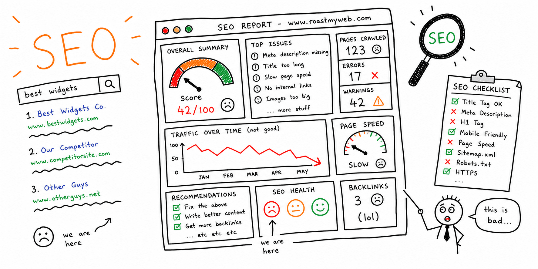
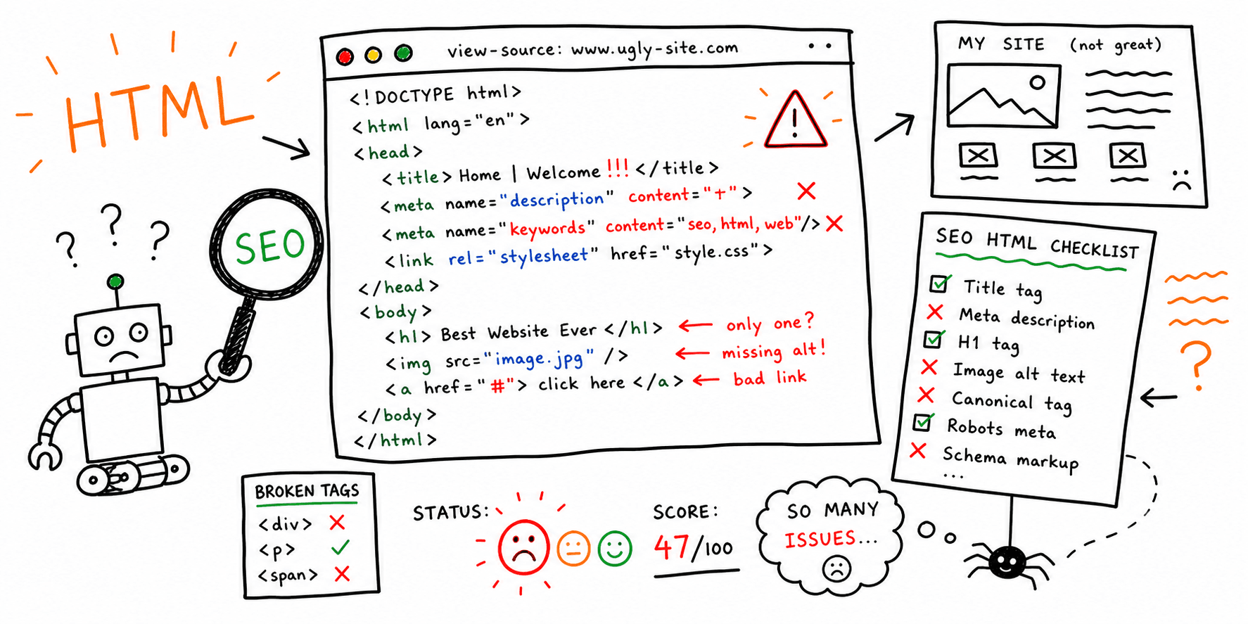
If you want a focused UX audit for a specific page, start here: Website UX Audit.
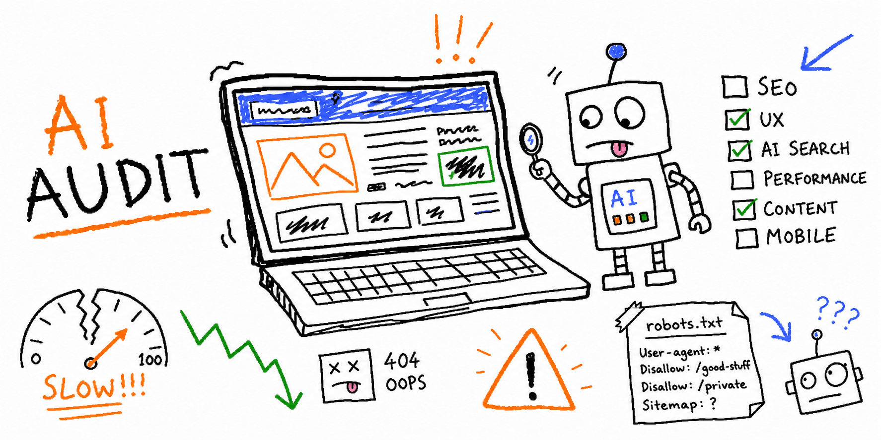
Want to streamline your UX auditing process and boost website performance? Roast My Web is an AI-powered solution that generates client-ready, branded PDF reports packed with actionable insights on design, UX, conversion, mobile responsiveness, and SEO.
Audit multiple sites, compare performance against competitors, and receive tailored recommendations for every section of your website. Join over 2,300 users who trust Roast My Web to transform tedious audits into an efficient, results-oriented workflow, empowering them to resolve critical issues and elevate their clients’ online presence.
Level Up Your Web Experience
A well-designed website is the foundation of a successful online presence. In today’s digital landscape, your website is often the first impression potential customers have of your brand. That’s why it’s essential to understand your target audience, craft engaging content, and optimize your site for search engines. By following web design best practices, you can enhance user experience, drive conversions, and build a strong brand identity that stands out in a crowded marketplace.
Website performance is a critical factor in user satisfaction and search engine rankings. Fast loading times, mobile responsiveness, and seamless navigation all contribute to a positive user experience. Implementing accessibility features ensures your website is usable by everyone, regardless of ability, while cross browser compatibility guarantees a consistent experience for all visitors. These elements work together to create a well designed website that not only attracts visitors but keeps them engaged.
Ultimately, prioritizing user experience and adhering to web design best practices will help your business achieve a successful online presence. By focusing on accessibility, performance, and search engine optimization, you can deliver a seamless user experience that delights users and supports your business goals.
Understanding the Target Audience
Knowing your target audience is the cornerstone of creating a website that truly resonates. It’s about more than just demographics - it’s about understanding user needs, preferences, and behaviors. By gathering user feedback and conducting user testing, web designers can ensure the website meets user expectations and delivers a smooth user experience.
A clear visual hierarchy, intuitive navigation, and thoughtfully designed interactive elements help guide users through your website, making it easy for them to find what they need and encouraging visitors to engage with your content. When you design with your audience in mind, you create a user experience that feels personalized and relevant, increasing the likelihood of achieving your business objectives.
Web designers who prioritize understanding their target audience can craft websites that are not only visually appealing but also user friendly and effective. This approach leads to higher user satisfaction, improved engagement, and a website that stands out in both usability and design.
Why Knowing Your Audience Matters
Understanding your target audience is essential for building a successful website that delivers results. When web designers have a clear picture of who their users are, they can create a visually appealing, user-friendly site that’s optimized for search engines and tailored to user expectations. This knowledge allows businesses to fine-tune their content, design elements, and overall web design process to better meet user needs.
A deep understanding of your audience can improve user engagement, boost conversions, and help establish a strong online presence. It also enables you to protect user data, implement accessibility features, and provide a seamless user experience across all devices. By enhancing search engine visibility and search engine rankings, you can attract more organic traffic and grow your business online.